Preview image. Unlock full-res
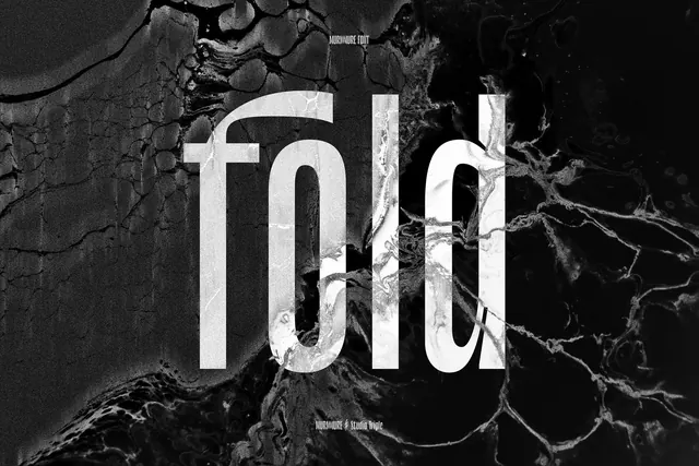
High-contrast poster with lowercase fold lettering set over a liquid black-and-white marbled background.
Summary
An experimental type poster spelling fold in bold lowercase over an organic ink-marble texture.
Visual description
White letterforms with a curved f terminal dominate center frame while dark veined marbling flows behind and through the counters. Small Murmure Font and Studio Triple credits sit top and bottom. Grain and high contrast give the piece a printed, tactile feel despite the fluid background.
Key takeaway
Letting texture bleed into display type creates depth without adding secondary graphics.
Reuse notes
Useful for font launches, print zines, or brand systems that pair brutal type with organic surfaces.
More like this


Keep what you find
A free account saves references to boards and can send you a weekly email of picks based on what you save.
To see every result, go Pro.