Preview image. Unlock full-res
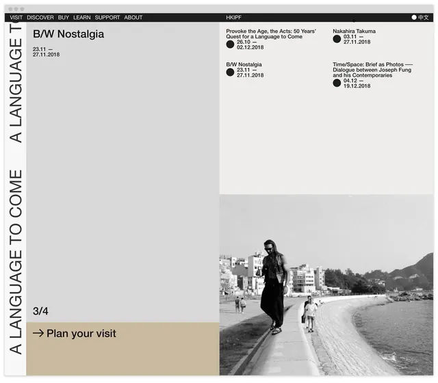
Editorial layout for a cultural institute using vertical sans-serif titling, grid-structured event listings, and a large black-and-white photograph of urban beach life.
Summary
Exhibition layout for HKIPF (Hong Kong International Photo Festival) using vertical sans-serif type, a grid of event titles with dates, and a full-width photograph.
Visual description
A monochromatic, text-heavy layout dominated by the word "A LANGUAGE TO COME" running vertically down the left side in a bold condensed sans-serif. The main content area displays three columns of exhibition titles, opening dates, and duration ranges (ranging from October to December 2018) aligned left. A horizontal band containing "DISCOVER BUY LEARN SUPPORT ABOUT" forms a navigation header at the top, with "HKIPF" and a language toggle on the right. The bottom half is a large-scale black-and-white photograph of a woman in a dark coat standing on a beach with buildings and mountains in the background, illustrating a scene from one of the exhibitions. The entire piece sits on a light grey background, creating stark contrast with black text and the monochromatic photograph.
Key takeaway
Vertical orientation of a key phrase as a framing device that doubles as visual rhythm. Grid-based text hierarchy for handling many parallel information streams (multiple exhibitions, dates, titles). Full-bleed photograph at bottom acting as anchor and emotional core while text occupies the conceptual space above.
Reuse notes
Effective for institutions presenting multiple programs or offerings simultaneously without overwhelming the viewer. Works well for cultural, academic, or archive-focused organizations. The vertical type works best with generous negative space and is particularly suited to portrait-oriented posters or tall digital layouts.
More like this

Keep what you find
A free account saves references to boards and can send you a weekly email of picks based on what you save.
To see every result, go Pro.