Preview image. Unlock full-res
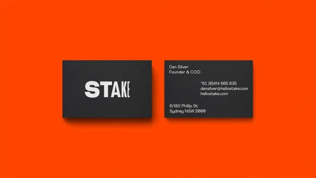
Front-and-back charcoal business cards with a chunky mixed-weight wordmark, laid flat on a saturated orange field.
Summary
A brand-identity presentation of two charcoal business cards (front and back) centered on a flat, saturated orange background, defined by a wordmark that shifts weight and width mid-word.
Visual description
Two dark charcoal cards sit side by side on a vivid orange-red field with soft drop shadows. The left card carries only the white all-caps wordmark: the first two letters are heavy and extra-bold, the remaining letters abruptly switch to a lighter condensed cut, creating a built-in typographic contrast. The right card is the information side: name and title top-left, phone/email/website right-aligned mid-card, and a street address bottom-left, all in small white sans-serif with generous negative space between the clusters.
Key takeaway
A wordmark can generate its own visual interest purely through a mid-word weight/width switch, no icon needed. Pairing near-black cards with one loud background color makes a minimal system feel energetic.
Reuse notes
Strong reference for fintech or startup stationery where the identity rests on typography alone. The corner-anchored info layout with right-aligned contact details is a reusable card grid. Works best when the brand color is bold enough to carry the empty space.
More like this



Keep what you find
A free account saves references to boards and can send you a weekly email of picks based on what you save.
To see every result, go Pro.