Preview image. Unlock full-res
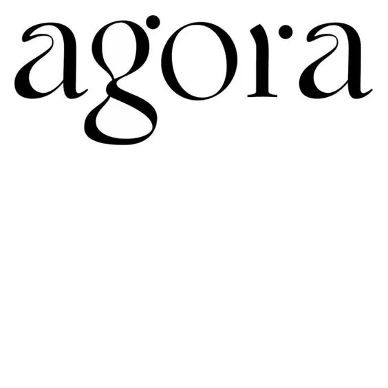
Black lowercase "agora" wordmark in an extreme-contrast display serif with a distinctive cinched-waist g, set on white.
Summary
A five-letter lowercase logotype, "agora", drawn in an extreme thick-thin display serif where the g's looping descender becomes the mark's signature detail.
Visual description
Solid black letterforms sit in the upper portion of a plain white square, leaving generous empty space below. Stroke contrast is pushed to the limit: bowls swell into heavy blobs while joins and hairlines thin almost to nothing. The g cinches to a narrow waist before ballooning into a large open-loop descender that swings below the baseline; the r carries a teardrop terminal and the o's tilt slightly, giving the word a calligraphic rhythm despite its hard black-and-white finish.
Key takeaway
One exaggerated letterform (the looping g) is enough to make a short lowercase wordmark ownable. Extreme stroke contrast reads as luxury without any color, imagery, or supporting elements.
Reuse notes
Reference for fashion, culture, and boutique brand wordmarks where a single display-serif word carries the identity. Works at large sizes only; the hairline joins will fail small or reversed on busy backgrounds. Pair with a neutral sans for supporting text.
More like this
Keep what you find
A free account saves references to boards and can send you a weekly email of picks based on what you save.
To see every result, go Pro.