Preview image. Unlock full-res
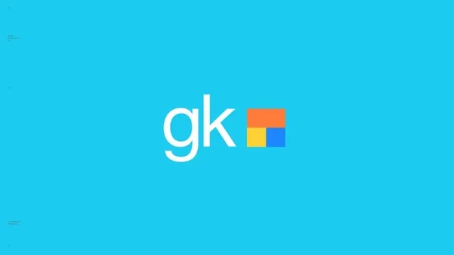
Brand presentation slide with a white lowercase "gk" logotype and an orange-yellow-blue square grid mark centered on a flat cyan field.
Summary
A widescreen identity-presentation frame: the lowercase letterpair "gk" in thin white sans-serif sits beside a compact grid mark of orange, yellow, and blue rectangles, all centered on a saturated flat cyan background.
Visual description
The entire 16:9 frame is a single flat cyan. Centered is a two-part lockup: at left, "gk" set lowercase in a light-weight geometric sans with a single-storey g; at right, a square symbol divided Mondrian-style into a wide orange block on top and a yellow plus blue block below. Tiny, barely legible caption text sits in the frame's corners and margins, giving it the feel of a case-study slide. Nothing else occupies the composition, so the mark floats in generous even space.
Key takeaway
Three small blocks of warm and primary color are enough to energize an otherwise monochrome lockup; the flat cyan field acts as a brand color and a stage at once. Ultra-thin type next to solid color blocks balances delicacy against weight.
Reuse notes
A clean template for logo-reveal slides and portfolio case studies: full-bleed brand color, centered lockup, whisper-quiet corner captions. The color-grid symbol pattern suits tech, education, or creative-tools brands that want a friendly, modular feel. The thin logotype needs large sizes or high-resolution contexts to stay crisp.
More like this



Keep what you find
A free account saves references to boards and can send you a weekly email of picks based on what you save.
To see every result, go Pro.