Preview image. Unlock full-res
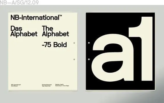
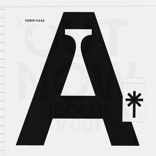
Typography specimen sheet displaying NB-International and Das Alphabet sans-serif typefaces side-by-side in bold weight with minimal layout and reference annotations.
Summary
A minimalist font documentation sheet comparing two related sans-serif typeface families (NB-International and Das/The Alphabet) in bold weight, with clean spacing and technical reference information.
Visual description
Off-white/beige background with top border in light gray. Left panel: Small black sans-serif text lists "NB-International" and "Das Alphabet" typeface names with "-75 Bold" weight designation and small footnote details. Subtle dot bullets are visible. Right panel: Large bold black lowercase letter "a1" (or numeral/letter combination) occupies the space, displayed in the bold weight of the featured typeface. The letter is roughly 200-300px in height and uses generous whitespace. Top of image shows reference code "NB—A/SG/12.09". The layout is split vertically, with the descriptive information on the left using smaller type and the specimen glyph on the right using oversized display sizing, creating a professional, archival aesthetic typical of foundry specimen sheets.
Key takeaway
The side-by-side comparison format allows direct visual evaluation of typeface characteristics. The oversized specimen glyph showcases the font's construction and personality in a single, unambiguous view. The minimal information density signals confidence and professionalism (no marketing language, just facts).
Reuse notes
Works for type foundries, design system documentation, brand guidelines, or any project needing to present typeface options. The beige/off-white background is neutral and print-friendly. Scale the specimen letter to fill available space while keeping the reference information visible. Test print reproduction if designing for physical collateral. The format pairs well with additional specimens showing multiple weights and styles on subsequent sheets.
More like this

Keep what you find
A free account saves references to boards and can send you a weekly email of picks based on what you save.
To see every result, go Pro.