Preview image. Unlock full-res
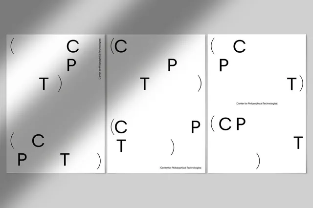
Three-card type system exploration showing variations of C, P, T letters with parentheses in grayscale gradient backgrounds.
Summary
A typographic study showing three variations of a letter arrangement system using C, P, T characters with parentheses in different spatial compositions over grayscale gradient backgrounds.
Visual description
Three cards arranged horizontally, each with a different gradient background fading from dark gray to light. Each card explores the positioning and hierarchy of three letters (C, P, T) along with paired parentheses in a sans-serif typeface. The left card has a darker gradient and places letters in a scattered composition. The middle card uses a lighter gradient with more structured vertical centering. The right card has an off-white gradient and tighter, more constrained letterforms. Small text reading "Center for Philosophical Technologies" appears in some cards. The overall treatment is minimal and technical.
Key takeaway
A geometric exploration of how the same set of elements can be arranged in different spatial configurations within a grid, useful for understanding modular typography systems and the impact of placement on visual balance and rhythm.
Reuse notes
Effective reference for designing variable type systems or exploring letterform permutations. Works well for academic or research-focused design contexts. The grayscale gradient backgrounds add subtle visual interest without overwhelming the typography.
More like this


Keep what you find
A free account saves references to boards and can send you a weekly email of picks based on what you save.
To see every result, go Pro.