Preview image. Unlock full-res
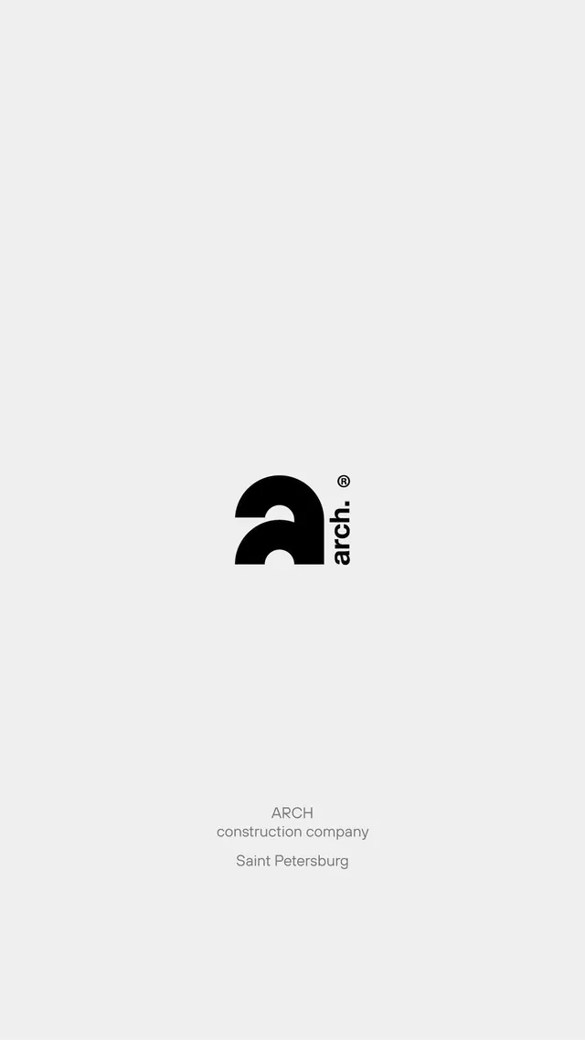
Minimal monochrome logo for construction company using a geometric arch symbol paired with lowercase sans-serif type and registration mark on light gray background.
Summary
A minimalist black logo for a construction company featuring a geometric arch symbol paired with lowercase "arch" type and a small registered trademark symbol, centered on a light gray field.
Visual description
A single-color mark on a light gray background. The logo comprises a solid black arch symbol (two curved lines meeting at a peak) positioned to the left of lowercase sans-serif type reading "arch" in a contemporary geometric font. A small registered trade mark symbol sits above the letterform. The composition is perfectly centered vertically and horizontally, with significant white space surrounding all elements. The arch shape suggests both architectural form and a minimalist interpretation of a capital "A". No additional ornamentation or color is present.
Key takeaway
The arch symbol as a literal and conceptual reference (architectural structure) that doubles as a letter form, enabling a compact two-in-one mark. The use of generous negative space that allows a small logo to feel confident and premium. The restraint of adding only a registration mark as the single accent, which signals brand professionalism without noise.
Reuse notes
Ideal for construction, real-estate development, architecture firms, or engineering consultancies seeking a modern, understated brand mark. Works at any scale due to its geometric simplicity; renders equally well on letterhead, signage, or digital. Monochrome in principle so no color reproduction costs. Low visual noise makes it suitable for secondary placements (footer, invoice, email signature). Pairs well with clean, minimal sans-serif system fonts; avoid script or decorative typefaces that would break the aesthetic.
More like this
Keep what you find
A free account saves references to boards and can send you a weekly email of picks based on what you save.
To see every result, go Pro.