Preview image. Unlock full-res
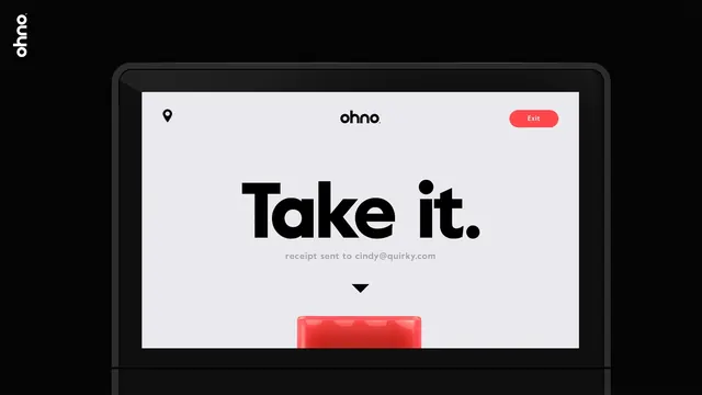
A bold, high-contrast app UI screen for a red vending kiosk interface displaying a confirmation message with a striking red accent color and simplified typography.
Summary
A vending kiosk confirmation screen showing a transaction complete state, with a large black headline "Take it," receipt confirmation text, and a bold red product graphic at the bottom. The interface uses high contrast and minimal components.
Visual description
Light gray/beige screen background with a clean top bar containing a location pin icon at left, "ohno." branding in the center, and a prominent red rounded "Exit" button at right. Below, centered white space dominates with an oversized bold black sans-serif headline reading "Take it." A single line of smaller gray text confirms "receipt sent to cindy@quirky.com." A downward chevron points to the bottom of the screen where a large red product graphic (partially visible) suggests a physical item or product representation. The overall layout prioritizes the headline and action, with the red accent used strategically for call-to-action and product identity.
Key takeaway
High contrast (black on light, red as accent) makes UI instantly readable and striking. Oversized type hierarchy leaves no ambiguity about the primary message. The red unifies the brand/product identity across exit button and product graphic. Minimal components focus attention on the transaction outcome.
Reuse notes
Strong reference for transaction confirmation and post-action screens in e-commerce or kiosk interfaces. The red-accent-on-light pattern works well for actionable moments or product highlights. The layout (top bar with icon/brand/button, centered content, bottom visual) is modular and applies to other confirmation flows. The scale of the headline ("Take it.") is critical—commands attention without feeling aggressive.
More like this

Keep what you find
A free account saves references to boards and can send you a weekly email of picks based on what you save.
To see every result, go Pro.