Preview image. Unlock full-res
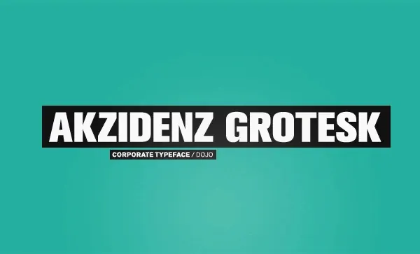
Minimal type specimen showing the Akzidenz Grotesk sans-serif typeface name on a turquoise background with a red corporate typeface label.
Summary
A minimalist type specimen featuring the Akzidenz Grotesk typeface name displayed in white sans-serif on a bright turquoise background, with a small red label indicating "Corporate Typeface / DOJO."
Visual description
Horizontal composition with a vibrant turquoise background dominating the frame. Centered in the upper half is "AKZIDENZ GROTESK" rendered in a bold, condensed sans-serif font in white. Below the main typeface name is a small red rectangular label with white text reading "CORPORATE TYPEFACE / DOJO" in a smaller sans-serif. The design is flat with no gradients, shadows, or dimensional effects. The bright, saturated turquoise and red create high visual contrast and energy.
Key takeaway
Simplicity and bold color choice as the specimen strategy: rather than showing character sets and weights, the designer lets the typeface name and vibrant background color carry the entire concept. The flat, graphic approach positions Akzidenz Grotesk as contemporary and accessible despite its classic heritage.
Reuse notes
Strong reference for minimalist type specimen design and branding of typefaces. The color choice is unconventional (many classical type specimens use neutral palettes) and makes the specimen memorable. Useful for modern type foundry or font library branding. The flat design approach works well for web-first or digital-first type presentations. Study for understanding how context (color, background, negative space) frames a typeface as a design material.
More like this


Keep what you find
A free account saves references to boards and can send you a weekly email of picks based on what you save.
To see every result, go Pro.