Preview image. Unlock full-res
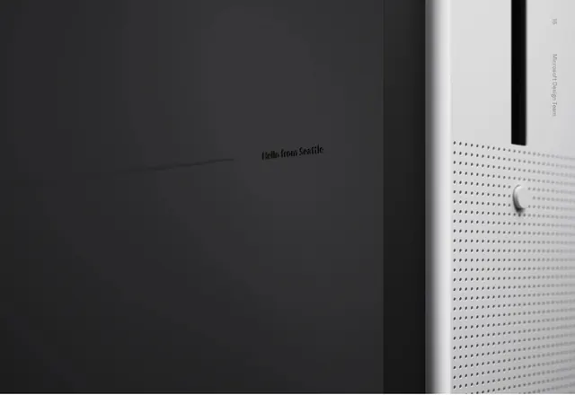
A split-screen design combining a plain dark wall with text and a perforated white panel with a minimal dial, emphasizing stark contrast and Swiss minimalism.
Summary
A two-panel minimalist composition: one half features text on a dark background, the other shows a white perforated surface with a single rotary control, creating stark visual contrast through material and color.
Visual description
The image splits vertically into two equal halves. Left side: dark charcoal background with text reading "Hello from Seattle" and some vertical text on the far right edge. Right side: white background with a regular grid of small perforations and a single circular dial or rotary knob in light gray. The contrast between the two halves is dramatic—dark negative space against light positive space. Typography appears to be a clean sans-serif, small in scale. The perforated pattern creates subtle texture and suggests product design or interface elements.
Key takeaway
The power of extreme constraint and binary contrast. By limiting the palette to black/white/gray and using only text and simple geometric forms (dots, circle), the design achieves maximum visual impact. The split composition creates asymmetry within a structured grid.
Reuse notes
Reference for minimalist poster design, tech product aesthetics, or high-contrast interfaces. Works well for demonstrating how material details (perforation, dial) can communicate function and create visual interest without color or imagery. The split composition is useful for showing dialogue, before/after, or analog/digital contrasts.
More like this





Keep what you find
A free account saves references to boards and can send you a weekly email of picks based on what you save.
To see every result, go Pro.