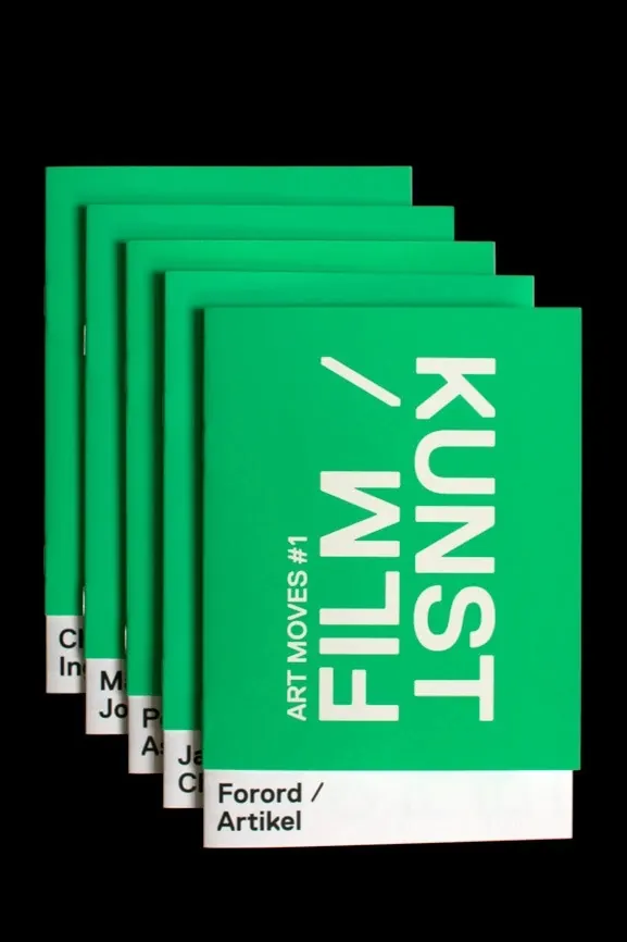
Preview image. Unlock full-res
Vintage-styled type composition in earthy color palette with offset overlapping letterforms.
Summary
A retro-styled typographic composition with warm earthy colors and overlapping letterforms arranged in an intentionally loose, playful offset grid.
Visual description
Multiple lines of type rendered in warm browns and tans, slightly offset from one another to create visual rhythm and depth. The letterforms appear to be a mix of serif and sans-serif weights, contributing to a casual, handmade aesthetic despite being typeset.
Key takeaway
Warm-palette retro type as a cohesive design move. The earthy colors and loose composition evoke 1970s-80s editorial design while remaining contemporary through careful color harmony.
Reuse notes
Effective for editorial headers, poster treatments, or branding that wants to communicate vintage or nostalgic sentiment. The warm palette favors print applications. Works best with plenty of white space to avoid visual chaos.
More like this

Keep what you find
A free account saves references to boards and can send you a weekly email of picks based on what you save.
To see every result, go Pro.