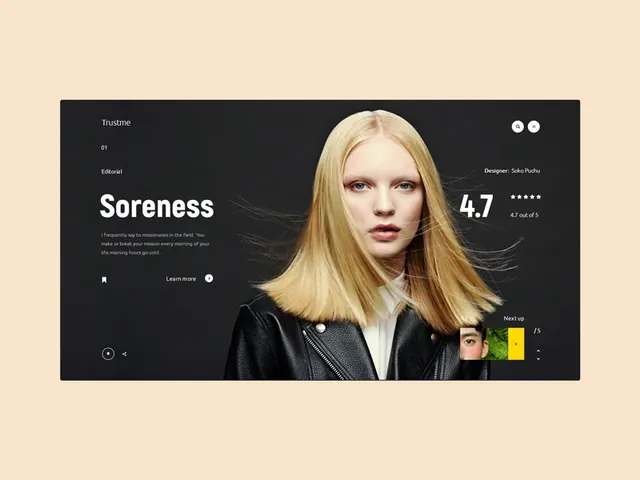
Preview image. Unlock full-res
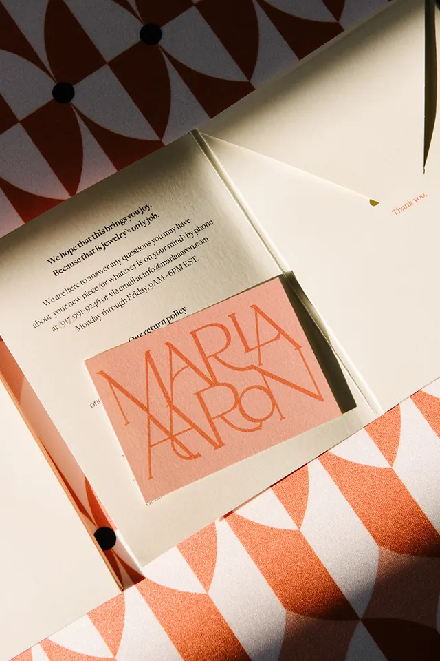
Warm editorial layout with beige, cream, and brown tones creating a soft, approachable color story.
Summary
A warm, editorial design using natural earth tones—cream, beige, and brown—with a soft, organic composition suggesting a printed layout or brand collateral.
Visual description
Dominated by warm neutral tones: cream (#F0DEC5) occupies roughly half the composition, dark brown/charcoal (#262525) provides contrast and framing, with mid-tone browns (#8A6037, #AB8949) acting as accents. Layout appears editorial in nature, possibly a book cover, invitation, or brand material. Soft, organic feeling with warm typography and gentle spatial relationships.
Key takeaway
Warm, earth-toned color palettes create immediate approachability and elegance. The contrast between cream and dark brown provides visual hierarchy without harsh, cold grays. Muted browns feel premium and organic.
Reuse notes
Perfect for luxury brands, editorial design, hospitality, beauty, food, or anything requiring warmth and sophistication. The beige-brown palette works especially well in printed materials (books, invitations, packaging). Pairs well with serif typography and natural photography.
More like this





Keep what you find
A free account saves references to boards and can send you a weekly email of picks based on what you save.
To see every result, go Pro.