
Preview image. Unlock full-res
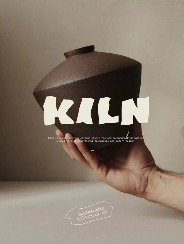
Editorial typography layout balancing warm cream text and accents against a soft warm-gray background.
Summary
A warm-toned editorial spread using soft creams and warm grays with clean sans-serif typography arranged in a balanced composition.
Visual description
Warm gray-beige background creates a soft, approachable tone. Off-white and cream typography sits clearly against the background with strong legibility. Dark warm brown or charcoal accents provide subtle contrast. The composition is spacious and cleanly arranged, with generous margins and breathing room. The typography appears to be a friendly, open sans-serif in multiple weights.
Key takeaway
Warm, muted palettes create approachable and trustworthy designs. Simple color harmony (all warm-shifted tones) creates cohesion without feeling boring.
Reuse notes
Excellent for editorial projects, publishing, or institutional branding. Works well for brands wanting a warm, human, professional feel. The palette is versatile enough for many industries and pairs naturally with warm photography or textured backgrounds.
More like this



Keep what you find
A free account saves references to boards and can send you a weekly email of picks based on what you save.
To see every result, go Pro.