Preview image. Unlock full-res
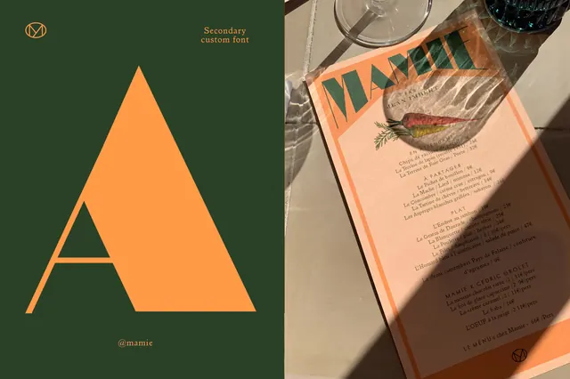
A two-part brand identity design for Mâmie restaurant: left side shows a geometric orange 'A' logo with circular monogram on dark green; right shows a cookbook/menu cover with orange border and illustrated fish imagery.
Summary
A two-part brand identity design for Mâmie restaurant: left side shows a geometric orange 'A' logo with circular monogram on dark green; right shows a cookbook/menu cover with orange border and illustrated fish imagery.
Visual description
The left panel features a dark forest-green background with a large geometric orange capital 'A' formed by three triangular shapes. At the top is a circular monogram combining geometric lines. Small text reads "Secondary custom font" and the handle "@mamie" at the bottom. The right panel shows a book or menu cover with an orange border frame. The cover contains illustrated botanical and fish imagery in vintage natural history style (red and yellow fish, green foliage) centered on a cream background. Dense body text in serif type fills the bottom half, suggesting menu descriptions or recipes. Both sections share the warm orange and earthy green palette, establishing visual cohesion.
Key takeaway
Logo and editorial identity designed as a unified system. The geometric, minimalist logo (left) contrasts effectively with the warm, illustrated, organic cover design (right), creating brand depth. The shared color palette (orange + green + cream) ties diverse applications together. Custom typography and botanical illustration add premium, artisanal character.
Reuse notes
Excellent reference for restaurant, food brand, or artisanal company identity systems. The geometric logo works well for signage, menus, and digital applications. The illustrated editorial side is perfect for menus, cookbooks, or packaging. The color palette (warm orange on green) reads as sophisticated and approachable. Works especially well for French, farm-to-table, or heritage cuisine concepts.
More like this


Keep what you find
A free account saves references to boards and can send you a weekly email of picks based on what you save.
To see every result, go Pro.