
Preview image. Unlock full-res
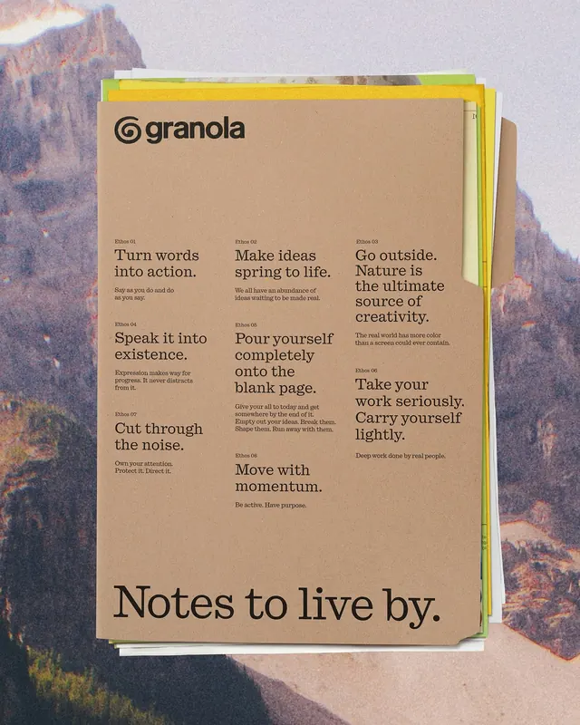
A cohesive visual identity featuring organic typography, natural color palette, and environmental design principles.
Summary
A cohesive visual identity featuring organic typography, natural color palette, and environmental design principles.
Visual description
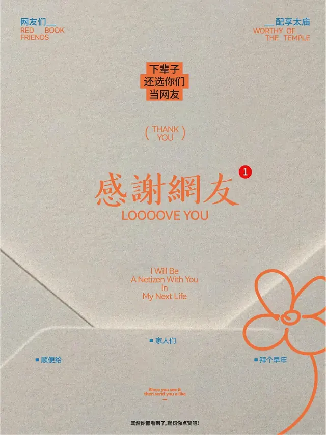
A brand identity showcase displaying typography, color palette, and possibly logo variations or icon system. Earth-tone color palette dominates: warm browns, muted terracottas, and soft sage or tan accents. Typography appears organic or hand-drawn, suggesting natural, artisanal positioning. Layout is clean but warm, avoiding sterile minimalism. May include texture or paper texture visible in the design. Overall aesthetic suggests sustainability, natural materials, craft.
Key takeaway
Warm, earthy color palette building trust and natural positioning. Organic, slightly imperfect typography adding personality and authenticity. System thinking—showing how elements work together across applications.
Reuse notes
Ideal for sustainable, artisanal, food, wellness, or eco-conscious brands. The warmth and earthiness build credibility for natural products. The organic type and color palette feel authentic rather than corporate. Can feel niche if not paired with strong visual systematics—requires a thoughtful design system underneath.
More like this
Keep what you find
A free account saves references to boards and can send you a weekly email of picks based on what you save.
To see every result, go Pro.