Preview image. Unlock full-res
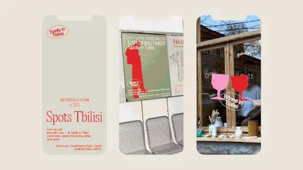
Visual case study collage showcasing brand system application across printed materials and real-world mockups (signage, cards, posters).
Summary
A portfolio-style photo-collage presenting Spots Tbilisi restaurant branding across printed touchpoints: typographic poster, stacked business cards, and storefront window display with coordinated signage.
Visual description
Three adjacent mockups arranged horizontally on a warm beige background. Left: a tall vertical poster with the name "Spots Tbilisi" in a spaced serif typeface (red/rust color) plus introductory copy and small institutional text (likely describing the brand). Center: a stack of cream-colored business cards or small collateral with matching red serif branding, one card layered slightly forward. Right: a rustic wooden storefront window frame photographed at street level, displaying a large red typographic symbol or logo on weathered wood. The consistent warm palette (cream, rust, wood tones, dark green hints) ties the pieces together, suggesting a cohesive identity system applied across environments.
Key takeaway
The warm, earthy color palette (rust/red with warm cream and natural wood) conveys restaurant heritage without cliche. The use of serif typography for the primary lockup creates distinction. Showing the brand in realistic production contexts (real storefront, actual business cards) proves that the system works at scale and builds confidence in the design.
Reuse notes
Essential reference for restaurant, cafe, or hospitality branding. The restrained color story and serif-led typography translate well to print, signage, and interiors. Use when designing a brand system that spans both printed collateral and environmental application, or when you need to show a client the system "in the wild."
More like this



Keep what you find
A free account saves references to boards and can send you a weekly email of picks based on what you save.
To see every result, go Pro.