Preview image. Unlock full-res
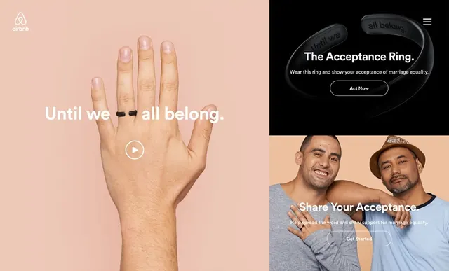
Composite campaign design split into four sections showing hands on warm peachy background and product/partnership imagery on dark background with strong typographic overlay.
Summary
A multi-panel campaign composition combining warm peachy tones and bright hands imagery on the left with dark, moody product and partnership sections on the right. Strong tonal contrast between halves.
Visual description
Left half features an open hand on a warm peachy-beige background with an identity badge visible. Center and right show split sections: upper right on dark background with product ring imagery and centered white typographic callout; lower right shows diverse figure portraits with CTA button against warm tones. Overall grid-based asymmetric layout balancing warm and cool tones. Play button visible suggesting video component.
Key takeaway
The tonal shift from warm to cool creates visual rhythm and guides viewer attention. Modular grid allows flexible message placement while maintaining compositional harmony.
Reuse notes
Works well for inclusive brand messaging or multi-message campaigns. The contrast between warm hand/connection imagery and cooler product sections helps differentiate messaging layers. Requires strong typography and clear focal points to prevent visual confusion.
More like this


Keep what you find
A free account saves references to boards and can send you a weekly email of picks based on what you save.
To see every result, go Pro.