Preview image. Unlock full-res
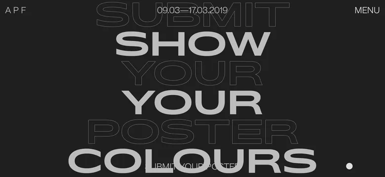
Bold poster design featuring large geometric sans-serif text layered across the frame with mixed outline and solid letter treatment, bold color hierarchy and date callout.
Summary
A dynamic poster design built entirely from bold oversized typography with mixed outline and solid letter rendering, announcing a festival with stark monochrome contrast and hierarchical type layering.
Visual description
The composition is dominated by large geometric sans-serif characters arranged across a dark charcoal background. Multiple words ("SUBMIT SHOW YOUR YOUR POSTER COLOURS") are layered and overlapping. Some letters are rendered as outlined/hollow shapes (#BABABA), while others are solid filled (#BABABA as well but denser). In the top-right corner, a date is centered ("09.03—17.03.2019"). In the top-left sits "APF" in small caps, with "MENU" aligned to the top-right. The letters appear to be a modern condensed sans-serif, all capitals, with clean geometry. Spacing is tight and intentionally overlapping to create visual tension.
Key takeaway
Typography-as-primary-graphic approach where the letterforms themselves are the design. The outline vs. solid letter technique creates depth and visual rhythm without additional imagery. All-caps bold geometric type dominates the visual field.
Reuse notes
Excellent for cultural events, festivals, or conferences with strong, confident branding. The bold typography approach works well for posters, web banners, or promotion materials targeting design-conscious audiences. Best when printed large or displayed at scale. Can feel aggressive so pairs well with elegant serif accents or photography. Strong reference for modernist poster design revival.
More like this

Keep what you find
A free account saves references to boards and can send you a weekly email of picks based on what you save.
To see every result, go Pro.