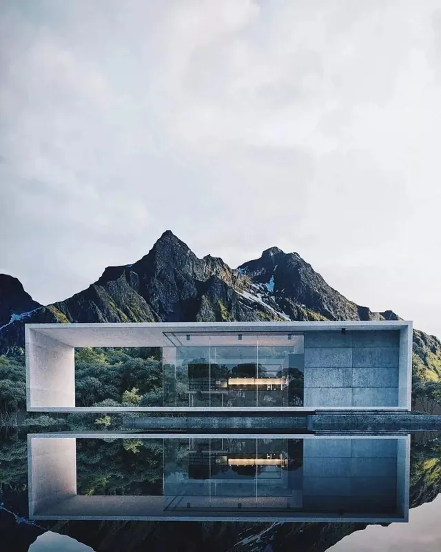
Preview image. Unlock full-res
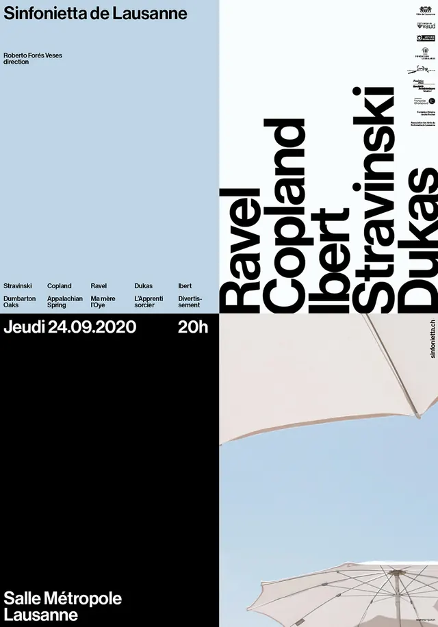
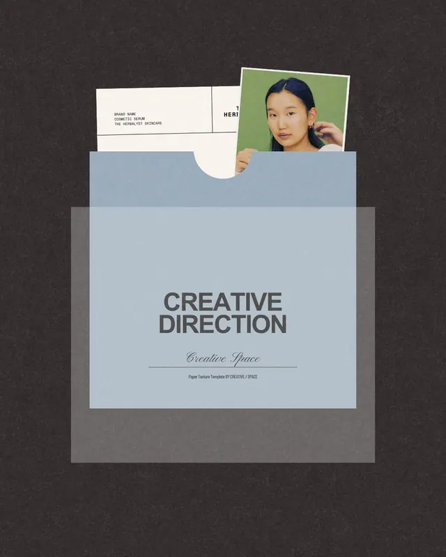
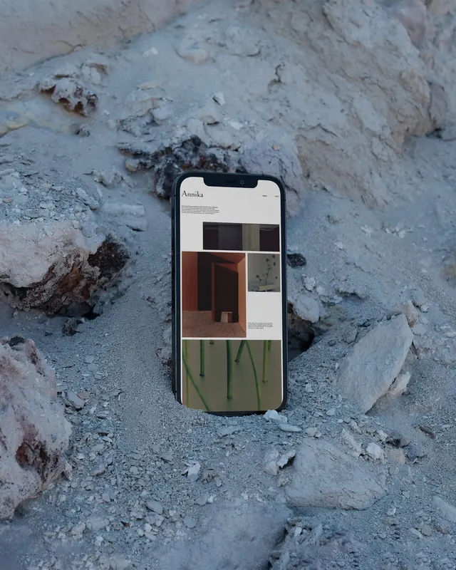
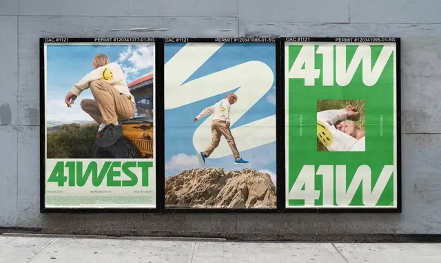
A composed editorial layout with cool blue and muted gray tones, featuring structured text placement against geometric background elements.
Summary
A composed editorial layout with cool blue and muted gray tones, featuring structured text placement against geometric background elements.
Visual description
The composition demonstrates a cool aesthetic with editorial treatment. The visual hierarchy employs sans-serif typography choices and establishes a professional mood through careful tone and spatial arrangement. The arrangement and visual weight guide focus to key elements.
Key takeaway
The effective use of color harmony and contrast to establish mood and visual hierarchy. The composition demonstrates how tonal choices and spatial arrangement communicate a clear visual message while maintaining compositional balance.
Reuse notes
Strong reference for professional creative direction in editorial, minimal design systems. The color palette and visual approach translate well to projects requiring cool presentation with professional emotional intent. Consider this composition's approach to visual weight and focus when creating similar work.
More like this

Keep what you find
A free account saves references to boards and can send you a weekly email of picks based on what you save.
To see every result, go Pro.