Preview image. Unlock full-res
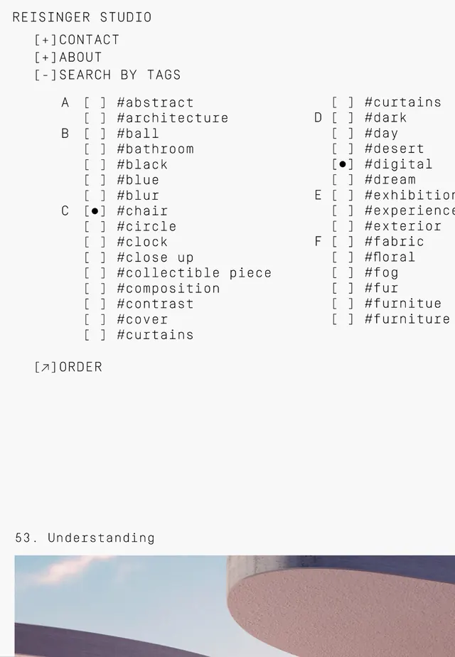
Architectural study of curved building forms paired with a structured navigation index, showing how spatial design and typographic hierarchy work together.
Summary
Two-part layout pairing a minimal architectural photograph of curved building forms with a condensed typography grid serving as a navigation or content index.
Visual description
Upper half shows pale beige and soft purple curved architectural forms against light gray, emphasizing clean edges and spatial interplay of solids against open space. Lower half displays "S3. Understanding" text with an architectural photograph thumbnail. To the left, a structured navigation index organized in multiple columns, using small sans-serif text in muted purple and beige tones. The index lists categories like "Search by Tags," "Architecture," "Social," "Mood," "Experience," "Material," "Furniture," etc., organized alphabetically within each column. The overall composition balances abstraction (upper image) with structured information design (lower index).
Key takeaway
The pairing of visual/spatial content with structured typographic navigation in a single unified system; the restrained color palette that lets form and typography do the work; the use of a condensed typeface and tight grid to make dense information scannable without visual clutter.
Reuse notes
Effective for design guides, architectural portfolios, or research platforms that need both imagery and taxonomy. The minimal palette works for institutional or sophisticated design contexts. The architecture-plus-index approach works well for projects where visual documentation and organized reference need equal weight.
More like this



Keep what you find
A free account saves references to boards and can send you a weekly email of picks based on what you save.
To see every result, go Pro.