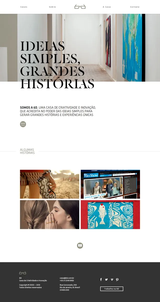
Preview image. Unlock full-res
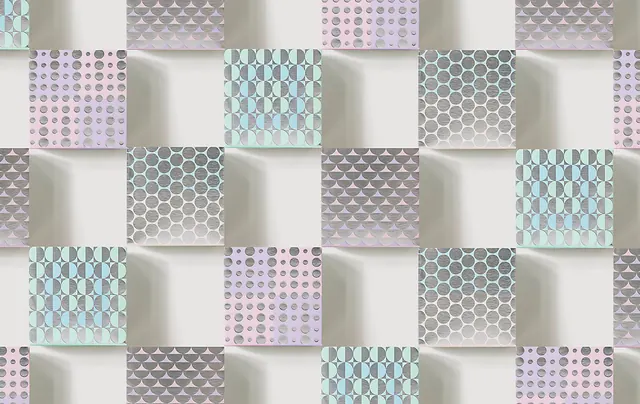
A restrained abstract composition using simple geometric forms and a limited color palette to explore negative space and visual balance.
Summary
A minimal abstract study where simple geometric forms and generous negative space create a sophisticated composition based on proportion and restraint.
Visual description
Few, simple geometric elements—possibly circles, rectangles, or similar basic shapes—positioned with intention across a mostly neutral or light background. Colors are muted and close in value, emphasizing form over color contrast. Ample white or neutral space surrounds the forms, which is as much a compositional element as the shapes themselves. The overall impression is calm, intentional, and refined.
Key takeaway
Less is more. By removing all ornament and restricting the visual vocabulary, each remaining element gains significance. The viewer must engage more actively to find meaning in minimal relationships.
Reuse notes
A reference for brand identity development, web design, gallery aesthetics, or minimalist product design. The principles work across scales from business cards to environmental graphics. Study the proportions and spacing. This approach suits luxury, design-forward, and contemporary brands. Can feel austere in large applications without supporting elements like photography or contextual content.
More like this



Keep what you find
A free account saves references to boards and can send you a weekly email of picks based on what you save.
To see every result, go Pro.