Preview image. Unlock full-res
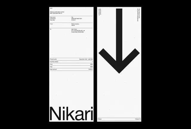
Two-page furniture brand system showing minimalist order documentation layout with oversized chevron mark and monochrome palette.
Summary
A minimalist two-page invoice system for a Finnish furniture brand featuring minimal tabular data and a dramatic centered chevron mark.
Visual description
Left page: white background with order details in small monospace caps (ship date, transaction info, from/to fields, order details: product, quantity, price, date received). Right page: white background with a large centered downward-pointing chevron in bold black, stacked vertically. Sparse typography reading "Nikari" at the bottom and "Finland" / "Pellava 13" location data in small sans-serif at bottom right.
Key takeaway
Whitespace and geometric symbols can carry entire brand presence without pictorial elements. Swiss-grid thinking applied to transactional documents creates a premium feeling even at small scale.
Reuse notes
Strong for luxury goods and B2B documentation. The chevron provides a distinctive mark that scales across sizes. This approach works because the brand itself is known (Nikari); unfamiliar brands may need more visible narrative. Clean typeface essential (monospace + sans-serif pairing shown here).
More like this

Keep what you find
A free account saves references to boards and can send you a weekly email of picks based on what you save.
To see every result, go Pro.