
Preview image. Unlock full-res
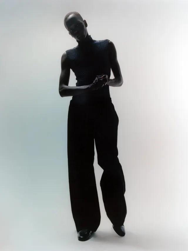
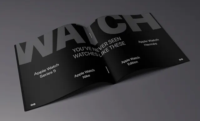
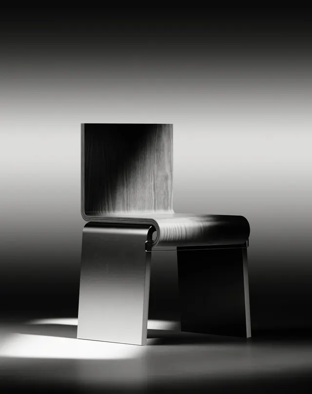
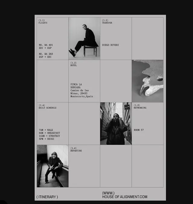
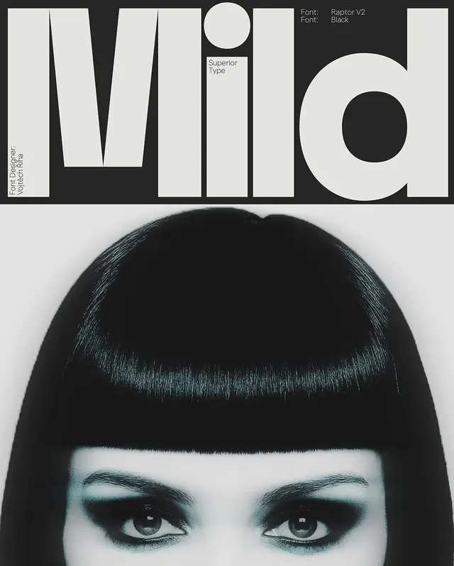
A striking black and white portrait or typographic design using a restricted grayscale palette for maximum contrast and simplicity.
Summary
A sophisticated, monochromatic composition using only shades of gray—from dark charcoal to light silver—creating a timeless, elegant visual through pure contrast.
Visual description
Entirely grayscale palette with no color variation. Dark charcoal-gray (#454545) dominates ~62% of the composition, providing weight and structure. Light silver (#D1D1D1) occupies ~27%, offering bright contrast zones. Mid-tone grays (#969696, #B5B5B5, #ABABAB) fill the remaining ~8%, adding subtle depth and transition zones. The composition appears portrait-like or type-based—possibly a portrait illustration or conceptual typography. Extreme economy of color creates sophistication and timelessness.
Key takeaway
Monochromatic grayscale palettes, when expertly deployed, are more sophisticated than color. Multiple gray tones create depth and visual interest without relying on hue variation. High contrast between dark and light creates drama without harshness.
Reuse notes
Perfect for editorial design, fine art, timeless brand marks, and anything requiring sophistication and durability. The monochromatic approach ensures the work reads well in any context—print, digital, small, large. Ideal for luxury, academic, and professional branding where timelessness matters more than trendy color.
More like this





Keep what you find
A free account saves references to boards and can send you a weekly email of picks based on what you save.
To see every result, go Pro.