Preview image. Unlock full-res
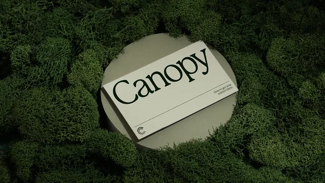
Minimalist brand identity for Canopy featuring elegant serif typography and natural color palette applied to a design system.
Summary
A design mockup showing a minimalist brand identity system for "Canopy," featuring the wordmark displayed on a circular stone platform surrounded by lush moss, demonstrating the brand's connection to nature through restrained color palette and serif typography.
Visual description
The image presents a brand presentation featuring a cream-colored circular platform set against vibrant green moss background. The "Canopy" wordmark appears in a refined serif typeface (likely a custom or bespoke typeface), rendered in deep black. The positioning and styling convey a luxury, nature-focused brand identity. The color palette is highly refined: deep forest green, warm beige, olive tones, and muted earth browns extracted from the moss and stone elements.
Key takeaway
The clever use of natural context (moss, stone) to communicate brand values without explicit nature imagery. The pairing of minimal geometric presentation with organic surroundings creates a memorable, premium aesthetic that works equally well as a logo system or packaging design.
Reuse notes
Strong reference for eco-conscious brands, luxury goods, or minimalist design systems. The serif typography suggests heritage and refinement. Works well for packaging, stationery, or editorial applications. Note the subtle color grading that makes the stone feel photographic rather than rendered.
More like this



Keep what you find
A free account saves references to boards and can send you a weekly email of picks based on what you save.
To see every result, go Pro.