Preview image. Unlock full-res
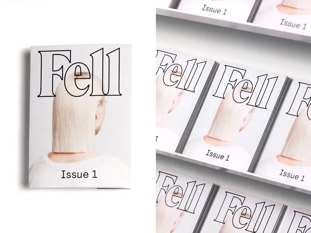
Magazine cover series with large outlined serif wordmark and photography of a figure against pale neutral tones.
Summary
Magazine cover for "Issue 1" of a salon publication, featuring a large outlined serif wordmark "Fell" paired with softly-lit photography of a figure against pale, neutral tones.
Visual description
Stacked series of magazine covers in cream, soft pink, and grey. The left cover prominently displays an outlined serif wordmark "Fell" above "Issue 1" in a smaller sans-serif. The covers are shown in a 3D perspective, revealing subtle product photography (blonde hair textures) integrated within the design. Typography hierarchy balances the bold headline wordmark against refined supporting copy. Minimal use of color and generous whitespace creates an elegant, gallery-like quality.
Key takeaway
Outline serif typefaces create premium, approachable elegance without the formality of solid serifs. Repeating the same design across multiple covers with subtle photographic variations reinforces brand identity while allowing modular flexibility.
Reuse notes
Strong template for beauty, wellness, or design-focused publications. The outlined serif works particularly well for luxury brands aiming for accessibility over intimidation. The 3D mockup treatment shown here is effective for portfolio presentation, though the actual publication would be viewed flat.
More like this

Keep what you find
A free account saves references to boards and can send you a weekly email of picks based on what you save.
To see every result, go Pro.