Preview image. Unlock full-res
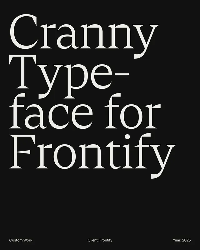
A type-specimen poster displaying the Cranny serif typeface in large white text on a black background, with client and production credits below.

Summary
A type-specimen poster showcasing the Cranny serif typeface in a bold, high-contrast composition with production metadata positioned below.
Visual description
Black background fills the entire canvas. The typeface name "Cranny Typeface for Frontify" is set in large serif capitals and lowercase text in white or off-white, arranged across the poster. The letters show elegant serifs with generous spacing. Below the primary text, three lines of smaller caption text read "Custom Work", "Client: Frontify", and "Year: 2025" in proportionally smaller type, aligned bottom-left, center, and bottom-right respectively.
Key takeaway
Elegant serif letterforms benefit from high contrast and generous breathing room. The structural clarity of the type is the sole design element, trusting the typeface itself to carry the visual weight. Minimal metadata presentation without disrupting the typographic focus.
Reuse notes
Essential reference for type designers and foundries creating specimen sheets. The black and white approach is timeless and works across all display contexts. The bottom alignment of credits provides a clean alternative to header placement. Use this format to highlight geometric or serif typeface characteristics. Works equally well for both commissioned custom typefaces and foundry releases.
More like this


Keep what you find
A free account saves references to boards and can send you a weekly email of picks based on what you save.
To see every result, go Pro.