Preview image. Unlock full-res
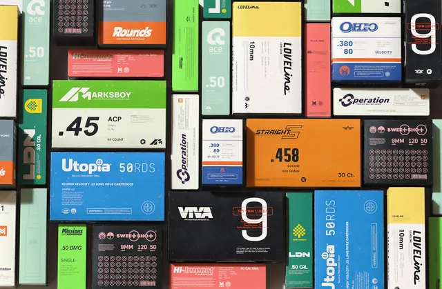
A comprehensive ammunition packaging collection displayed in a grid layout, featuring multiple brands and caliber types with bold typography, vibrant color blocking (neon green, orange, blue), and technical specifications.
Summary
A comprehensive ammunition packaging design system showcasing multiple brands and cartridge types arranged in a grid layout, unified by consistent typography, color-blocking strategy, and technical specification layouts. Brands visible include .45 ACP, Utopia, Marksboy, Operation, OHFO, Straight, LoveLine, and others in neon green, bright orange, and bright blue dominant colors.
Visual description
Approximately 15-20 individual ammunition boxes are arranged in a dense grid. Each box features bold, sans-serif typography identifying the brand and caliber (e.g., ".45 ACP", ".380", ".458 SOCOM"). Color blocking divides each box into distinct zones—neon green, orange, blue, or black fields with white typography and technical specifications listed in smaller print. Some boxes include circular target patterns or icon systems. The overall composition is data-dense but organized, with consistent spacing and alignment. The color palette is highly vibrant and contrasts sharply.
Key takeaway
The color-blocking system creates visual hierarchy and allows fast scanning of different products. Each brand gets its own color, aiding identification at a glance. The consistent grid layout and typographic system unify the entire range despite diverse colors and content. The technical data is rendered consistently across all boxes.
Reuse notes
Effective for product families, systems design, or any collection needing visual organization without looking cluttered. The color-per-brand approach scales well and is memorable. The typography system is strict and technical—appropriate for professional/industrial products. The grid layout is classic and timeless for catalog presentations.
More like this

Keep what you find
A free account saves references to boards and can send you a weekly email of picks based on what you save.
To see every result, go Pro.