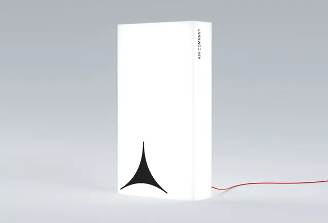
Preview image. Unlock full-res
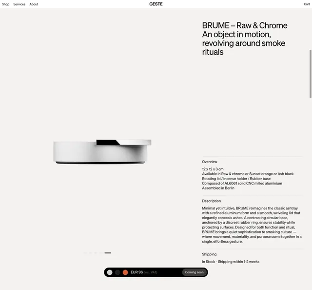
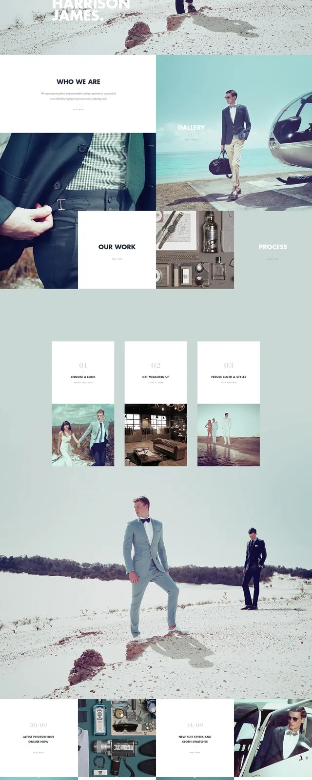
Minimal promotional layout with clean typography and muted neutral palette, showcasing oversized sans-serif headline over subtle background graphic.
Summary
A minimal design layout using oversized typography against a muted neutral background, demonstrating restraint and hierarchy through scale and spacing alone.
Visual description
Light neutral background with two dominant colors: muted gray and near-black. An oversized sans-serif headline anchors the composition, with supporting text in smaller scale. No imagery beyond typography; clean negative space dominates. Color palette is nearly monochromatic, emphasizing the power of type as the sole design element.
Key takeaway
Oversized type as the primary visual element can create striking, professional layouts when paired with disciplined whitespace and a tight neutral palette. The absence of decorative elements puts full weight on typography choices.
Reuse notes
Excellent default for minimal, corporate design systems or editorial layouts. Works across contexts that call for restraint and legibility. Pairs well with sans-serif type families that have strong weight variance. Only effective when copy is concise and hierarchy is clear.
More like this


Keep what you find
A free account saves references to boards and can send you a weekly email of picks based on what you save.
To see every result, go Pro.