Preview image. Unlock full-res
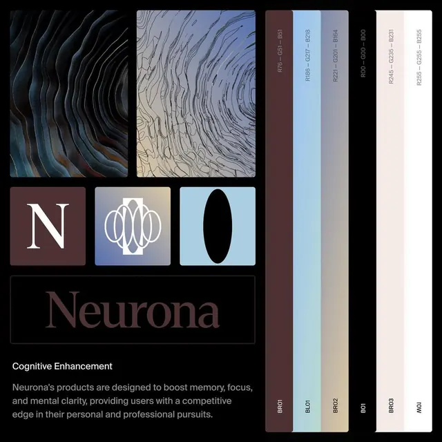
Brand identity system for Neurona (cognitive enhancement) featuring a grid of textured pattern swatches, the monogram logo, and a palette of slate blue, beige, cream, and deep charcoal tones.
Summary
Brand identity system for Neurona (cognitive enhancement) featuring a grid of textured pattern swatches, the monogram logo, and a palette of slate blue, beige, cream, and deep charcoal tones.
Visual description
Three-by-three grid of texture swatches in top half: concentric circles on charcoal, wavy vertical lines on pale gray, solid blue rectangle, solid white. Bottom row shows the monogram "N" in a burgundy-brown square, a circular blue design, and a black oval on light blue. Beneath the grid sits the brand name "Neurona" in a condensed sans-serif against charcoal, followed by the subline "Cognitive Enhancement" in smaller type. Beside the grid, three vertical bars display the palette: dark charcoal, light cream, medium gray, and slate blue rendered as tall gradients or solids. The overall composition is tight and architectural, emphasizing scientific precision and health-tech credibility.
Key takeaway
The texture grid as a foundational brand asset that communicates both precision and humanity (wave, circle, line patterns suggest neural activity). The monogram in a bold geometric frame is instantly ownable. The palette of deep and light tones creates accessible contrast for web/app use while maintaining sophistication.
Reuse notes
Strong framework for health-tech, supplements, or cognitive-science brands. The textural language works across digital and print. The upright palette presentation makes this ideal for a brand-guidelines template. Avoid using the textures as full backgrounds; they work best as accent or icon-fill elements to preserve sophistication.
More like this



Keep what you find
A free account saves references to boards and can send you a weekly email of picks based on what you save.
To see every result, go Pro.