Preview image. Unlock full-res
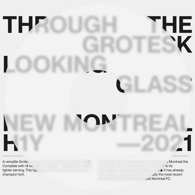
Overlapping typographic composition with words in black and ghosted/blurred gray, arranged asymmetrically on light background.

Summary
Text composition titled "Through the Grotesque Looking Glass" with layered typography. Some words appear in solid black, others ghosted and semi-transparent. Includes credit line referencing Montreal 2021.
Visual description
Asymmetric arrangement of uppercase sans-serif type on a light background. Key words (THE, THROUGH, GLASS) are rendered in solid black; intervening words (OUGH, GROTESQUE, LOOKING) fade into light gray or near-white. The layout creates visual depth through opacity variation and suggests overlapping letterforms. A thin horizontal rule and date/location credit complete the composition.
Key takeaway
The interplay between solid and transparent type creates layering and visual interest without adding graphic elements. The contrast forces focus to certain words while the faded text maintains reading flow.
Reuse notes
Strong for editorial design, posters, and typography showcases. The concept works at large scales where the opacity shifts are clearly legible. Suitable for artistic or experimental brief materials. Requires careful type choice for maximum impact.
More like this
Keep what you find
A free account saves references to boards and can send you a weekly email of picks based on what you save.
To see every result, go Pro.