
Preview image. Unlock full-res
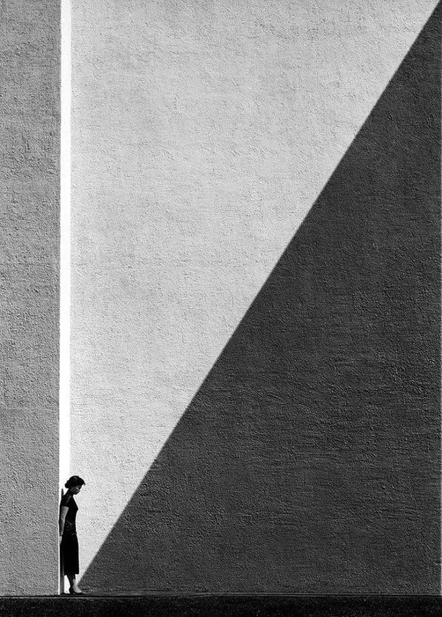
High-contrast minimalist design with balanced dark and light areas in a portrait-oriented layout.
Summary
A minimalist composition with nearly equal balance between dark charcoal and light gray, demonstrating the power of two-color palettes in creating visual interest through pure contrast.
Visual description
Nearly symmetrical division between dark (#171717) at approximately 50.2% and light gray (#EDEDED) at approximately 48.8% of the composition. The portrait-oriented format (1080x1350) shows a clean, geometric approach to minimal design with strong emphasis on contrast rather than complex imagery or typography.
Key takeaway
The simplicity of a two-tone palette executed with careful balance demonstrates that complexity in visual hierarchy can come from spatial division alone. This approach reduces cognitive load while maintaining visual sophistication.
Reuse notes
Perfect for abstract backgrounds, minimalist posters, or as a foundation for typography-focused designs where the background should not compete for attention. The balanced color split works well for split-screen layouts or divided composition approaches. Consider for black-and-white themed projects or when designing for print with limited color budgets.
More like this



Keep what you find
A free account saves references to boards and can send you a weekly email of picks based on what you save.
To see every result, go Pro.