Preview image. Unlock full-res
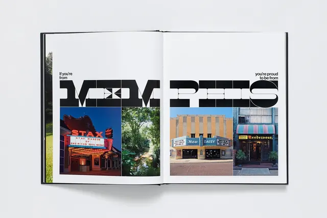
An open magazine spread featuring bold black headlines and a two-column grid of architectural and landscape photography, shot in a clean editorial layout.
Summary
A two-page magazine spread with chunky black sans-serif headlines paired with a balanced grid of four colored photographs—red theater, green trees, tan storefronts, urban architecture.
Visual description
Left page: a short text block and two bold phrases—"If you're from" / "you're proud to be from"—in all-caps black type. Right page: a two-by-two grid of photographs capturing civic landmarks (a red neon theater marquee, a tree-lined path, two different storefronts). White space separates the elements cleanly. The typeface is utilitarian and generous in size; the photography is composed and well-lit. Overall tone is editorial and city-focused.
Key takeaway
Swiss-style grid discipline applied to placemaking: large type + organized photo grid creates a sense of civic pride and structure. The balance between text and image is confident and unhurried.
Reuse notes
Ideal template for travel magazines, city guides, or place-based editorial. The grid and typeface conventions feel earnest and trustworthy. Use for publications or campaigns celebrating local identity, architecture, or urban life.
More like this

Keep what you find
A free account saves references to boards and can send you a weekly email of picks based on what you save.
To see every result, go Pro.