Preview image. Unlock full-res
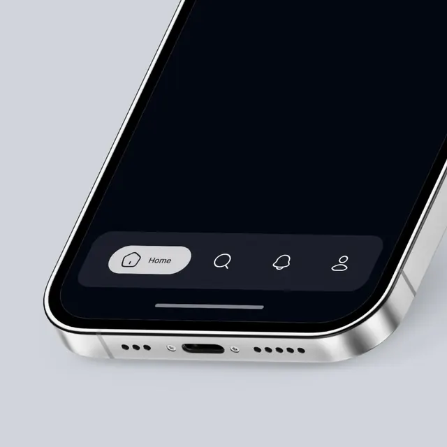
A cropped smartphone mockup shows a dark app screen with a rounded bottom navigation bar and simple line icons.
Summary
A cropped smartphone mockup shows a dark app screen with a rounded bottom navigation bar and simple line icons.
Visual description
The image shows a close-up angled smartphone with a metallic silver frame and a dark screen. Near the bottom of the screen is a rounded navigation tray with four icons, where the left item is highlighted in a light pill labeled Home and the other icons are outlined in white. A thin gesture bar sits below the tray, and the phone body shows speaker holes and a charging port along the lower edge.
Key takeaway
Use a soft, floating bottom nav with one active item pulled into a contrasting pill to create clear hierarchy without visual clutter. Pair that with thin line icons and generous rounding to keep the interface feeling refined and lightweight.
Reuse notes
This works well for premium dark-mode mobile apps that need simple, glanceable navigation. Reach for it when you want the nav to feel embedded in the device rather than pasted on top of it.