Preview image. Unlock full-res
Comprehensive design case study for Microsoft Copilot showing design thinking, system components, data visualization, interface mockups, and brand philosophy across accessibility and multimodal interaction patterns.

Summary
A ten-slide design case study documenting Microsoft's Copilot design approach, showcasing design system components, data visualization patterns, accessibility considerations, multimodal interface mockups, and brand narrative through typography and editorial layout.
Visual description
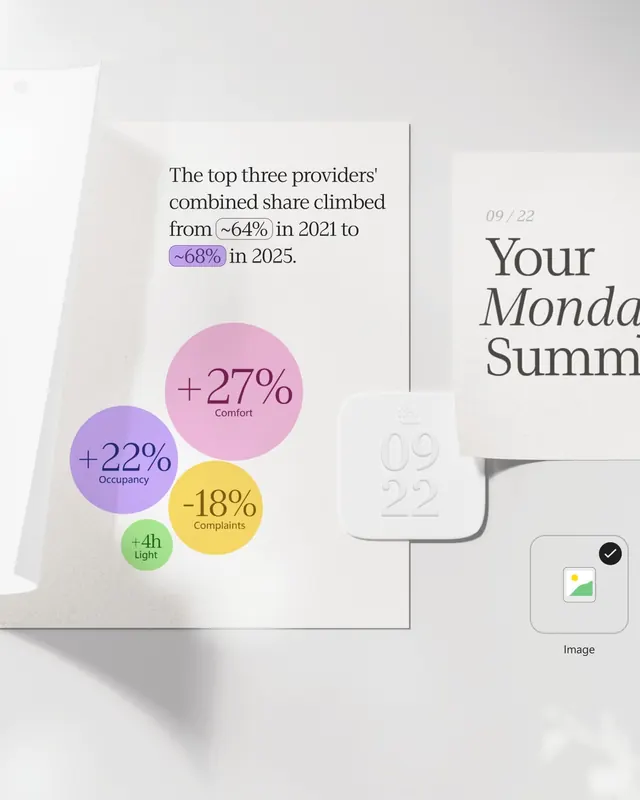
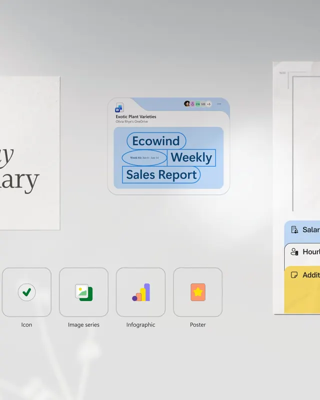
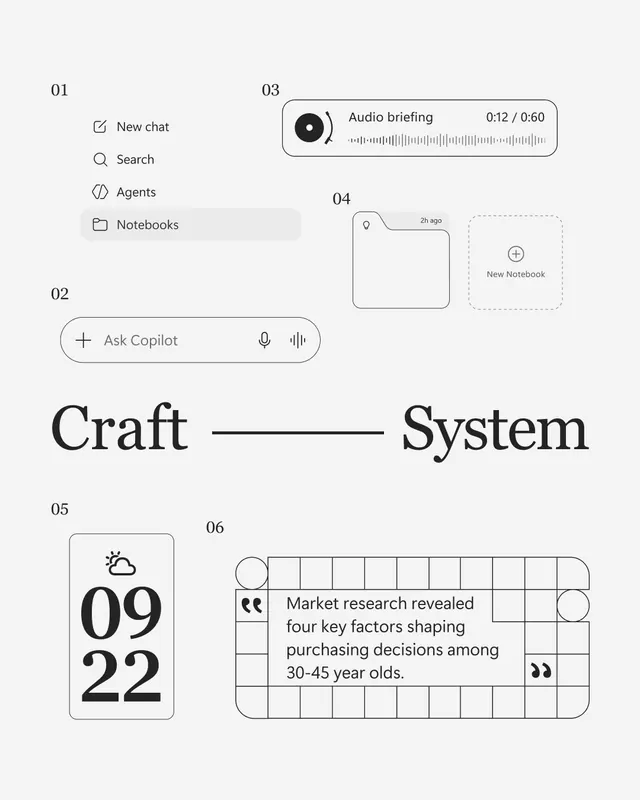
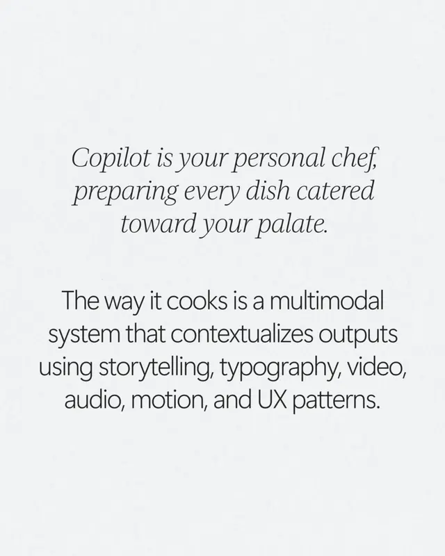
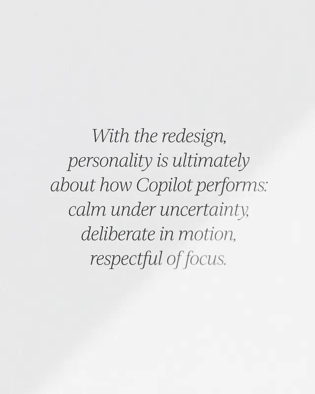
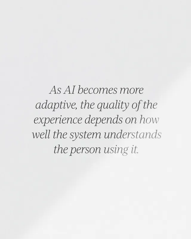
The carousel presents design process and outcomes across multiple frames. Slide 1 (cover) shows a collection of interface elements, content cards, and team members with labels, indicating a collaborative design effort. Subsequent slides present design concepts including live streams with participants, data visualization using colorful circles for metrics (occupancy, comfort, light), editorial typography discussing Copilot's role as a personal assistant, interface mockups showing prompt inputs and content generation, design system components organized in grids, and wireframes or sketches. Content cards display information hierarchically. Color palette is primarily white and light grays with pastel accent colors (purple, green, yellow, pink) for data visualization elements. Typography combines serif and sans-serif faces for visual hierarchy. The final slides show application examples including presentation creation and sharing workflows.
Key takeaway
How to communicate AI product strategy through visual narrative that balances technical components with human-centered messaging. The use of data visualization with intentional color coding makes complex concepts accessible. The design system approach ensures consistency across modalities (voice, text, visual). Editorial typography reinforces brand voice and personality.
Reuse notes
Strong reference for technology companies explaining complex AI or data products. The multimodal approach (showing voice, text, and visual) helps audiences understand how their product works across interfaces. The pastel color palette with white space reads as trustworthy and calm, appropriate for AI assistants that need to feel helpful rather than threatening. Use when you need to document design thinking for large teams or when accessibility and inclusive design are central to your message. The editorial layout approach works well for design system documentation and product announcements.