Preview image. Unlock full-res
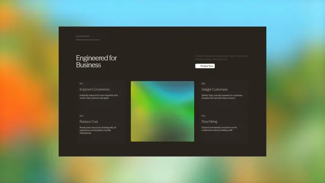
A motion exploration for a dark SaaS features section, showing animated UI component transitions cycling through a feature grid to highlight product capabilities.
More like this
See all

Summary
A motion exploration for a dark SaaS features section, showing animated UI component transitions cycling through a feature grid to highlight product capabilities.
Visual description
A dark UI layout with a large headline 'Engineered for Business' on the left, flanked by four feature descriptions arranged in a grid. The center contains a vibrant gradient card transitioning from yellow to green to cyan, creating a focal point against the dark background. A white Product Tour button sits in the upper right, while a gradient header blends from warm to cool tones.
Key takeaway
Place an animated gradient element or colorful focal point at the center of a dark information layout to create visual tension and guide attention, allowing text content to wrap naturally around the dynamic centerpiece while maintaining information clarity.
Reuse notes
Reach for this as a motion still reference. Pairs with minimal directions. Original by Ayush Soni.
More like this
Keep what you find
A free account saves references to boards and can send you a weekly email of picks based on what you save.
To see every result, go Pro.