Preview image. Unlock full-res
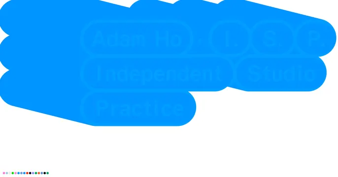
Mostly white card with overlapping bright-blue rounded blob shapes nearly hiding same-color studio-name text, plus a tiny row of color dots.
Summary
A near-white card where clustered bright-blue rounded shapes overlap a headline set in the same blue, so the studio name "Adam Ho, I.S.P. Independent Studio Practice" reads only as a faint tone-on-tone impression. The defining move is text deliberately camouflaged inside matching-color blobs.
Visual description
The upper-left half of the white field is filled with overlapping rounded-rectangle and pill blobs in a single bright azure blue. Behind and within them, large bold text in the same blue spells "Adam Ho ," / "I." "S." "P." on the top line, "Independent" "Studio" on the next, and "Practice" below, each word boxed by its own pill so the type is barely separable from the shapes. The lower-right stays empty white. A small horizontal row of multicolor dots sits in the bottom-left corner as the only varied-color element.
Key takeaway
The tone-on-tone trick of setting type the exact color of the shapes it sits in, so the card reads as an abstract blue form first and resolves into words on a second look. The lone dot row gives a tiny hit of color and rhythm against the monochrome.
Reuse notes
A bold, experimental choice for a design studio or portfolio confident enough to under-communicate. Legibility is intentionally low, so do not use it where the name must be read at a glance (feeds, link previews at small sizes). Pairs with a strong, recognizable studio identity that can carry the ambiguity.
More like this


Keep what you find
A free account saves references to boards and can send you a weekly email of picks based on what you save.
To see every result, go Pro.