Preview image. Unlock full-res
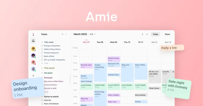
Soft pink OG card with the bold white "Amie" wordmark above a calendar app screenshot dotted with floating tinted task cards.
Summary
A product OG card for the Amie calendar app: a bold white "Amie" wordmark sits on a soft pink gradient above a real calendar UI screenshot with playful floating task cards.
Visual description
The background is a gentle pink gradient. Near the top center, "Amie" appears in a heavy white sans-serif. Below, a rounded-corner screenshot of the app fills the lower frame: a left sidebar of to-dos ("Design onboarding," "Write hiring criteria," "Q4 goals," "Personal," "Series to watch") beside a weekly calendar grid (March 2022, Mon-Sun) packed with pastel event blocks like "Monday sync," "Lunch break," and "Go for a run." Three tilted, soft-shadowed task cards, "Design onboarding 1 PM" (blue), "Polly x Ivo" (peach), and "Date night with Emmely 8 PM" (green), float off the screenshot's edges as if popping out of the interface.
Key takeaway
Letting a few tinted, slightly rotated cards break out of the product screenshot's bounding box adds depth and signals the app's playful, tactile feel. A pastel gradient ground keeps a dense UI from feeling cluttered.
Reuse notes
Ideal for a productivity, calendar, or planning app that wants to look both capable and friendly. Requires a genuinely tidy product UI to enlarge. The floating-card trick works best when the cards repeat real UI elements rather than generic shapes.