Preview image. Unlock full-res
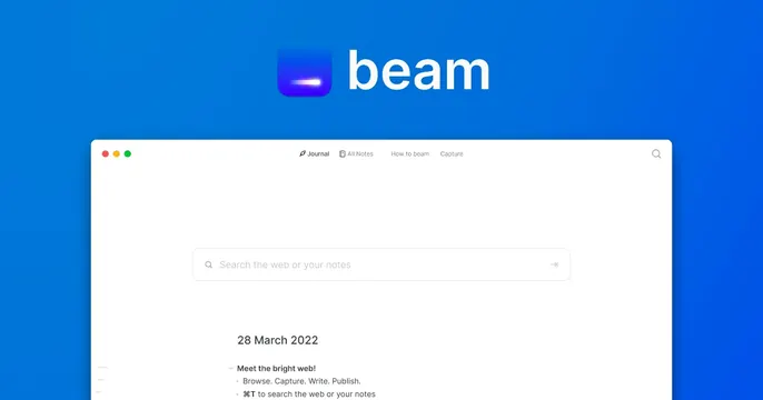
Blue OG card with a centered glowing app icon and lowercase "beam" wordmark above a floating product screenshot that bleeds off the bottom edge.
Summary
A bright blue OG card that pairs a glowing app icon and lowercase wordmark with a product screenshot peeking up from the bottom. The icon-plus-app-preview stack is the defining move.
Visual description
A solid blue field with a subtle gradient. Centered near the top, a rounded-square app icon glows with a violet-to-blue interior and a bright horizontal light streak, set beside the lowercase "beam" wordmark in white. Below, a white app window floats upward and bleeds off the bottom edge of the card, showing a top nav (Journal, All Notes, How to beam, Capture), a centered search field reading "Search the web or your notes", a date heading "28 March 2022", and a short bulleted note. The white product surface contrasts sharply with the saturated blue ground.
Key takeaway
Letting the app's own icon glow carry the brand color while a cropped product screenshot proves the product is real. Floating the UI off the bottom edge implies depth and continuity without needing a device frame.
Reuse notes
A reliable pattern for a SaaS or consumer app launch card. Depends on a clean, recognizable product screenshot and a single strong brand color. The cropped UI reads best at full size; at thumbnail the icon and wordmark do the work.