Preview image. Unlock full-res
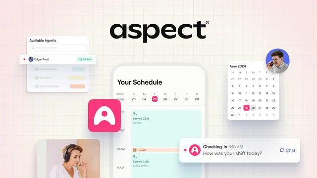
Centered wordmark over a soft pink-to-cream gradient, surrounded by floating product UI cards and lifestyle photos on a faint grid.
Summary
A centered lowercase "aspect" wordmark floats over a pastel pink-cream gradient, framed by scattered scheduling-app UI cards, a pink app icon, and two agent lifestyle photos on a faint blueprint grid.
Visual description
Soft pink top fading to warm cream, overlaid with a light technical grid. The bold black lowercase wordmark sits dead center, top third. Around it, product UI floats as separate cards: an "Available Agents" search panel with an "Edgar Frost / Highly Likely" row top-left, a "Your Schedule" mobile calendar with color-coded Service Calls and Break blocks center, a "June 2024" month picker right, and a "Checking-In" chat toast bottom-right. A rounded pink app icon and two circular and rectangular photos of headset call-center agents add human texture. The whole thing reads as a curated, slightly 3D collage.
Key takeaway
The blueprint-grid background tying a scattered set of UI fragments into one composed scene. Centering only the wordmark and orbiting it with product evidence sells the tool without a single headline sentence.
Reuse notes
Strong for a product-led SaaS where the interface itself is the pitch. Needs genuinely clean UI snippets and consistent corner radii or it looks busy. Best on a light pastel base where shadows and the grid stay subtle.