Preview image. Unlock full-res
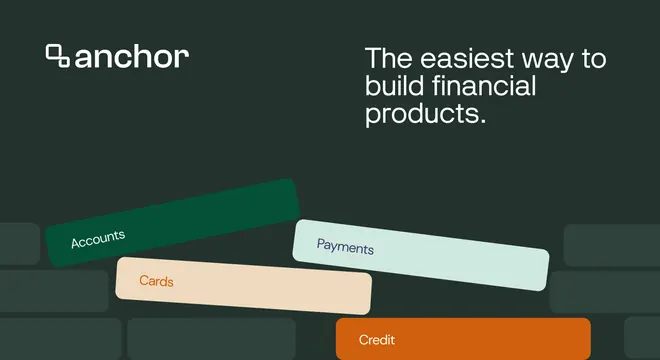
Dark green card with the logo and headline up top and four overlapping pastel pill-cards labeled with financial product names below.
Summary
A dark forest-green card with the brand mark top-left and headline top-right, anchored by four overlapping rounded pill-cards in green, peach, mint, and orange naming financial products. The tilted, layered tiles add depth to a flat scene.
Visual description
On a dark green background faintly patterned with brick-like blocks, the "anchor" wordmark and small mark sit top-left in white; a right-aligned three-line white headline reads "The easiest way to build financial products." top-right. The lower half is filled with four large rounded-rectangle "pill" cards at slight angles, overlapping each other: dark green "Accounts", peach "Cards", mint "Payments", and orange "Credit", each labeled in its own contrasting text color.
Key takeaway
Naming each product on its own colored pill-card and overlapping them at slight angles turns an abstract platform into a tangible stack of building blocks. Splitting logo to one top corner and headline to the other keeps the top airy while the tiles own the bottom.
Reuse notes
Good for fintech or platform products that bundle several modules and want to show breadth at a glance. The pill-cards are flexible: relabel them for any product set. The dark background makes the pastel tiles glow; on a light card the same tiles would need stronger fills.
More like this





Keep what you find
A free account saves references to boards and can send you a weekly email of picks based on what you save.
To see every result, go Pro.