Preview image. Unlock full-res
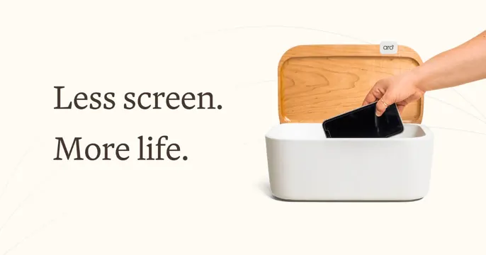
Warm cream OG card with a serif "Less screen. More life." headline on the left and a photo of a phone being placed in a fabric box on the right.
Summary
A warm cream card splitting a two-line serif headline from a product photo of a phone being dropped into a fabric-and-wood box. The defining move is the calm serif voice paired with a literal use-case shot.
Visual description
Soft warm off-white background with a few faint thin curved lines arcing across it. On the left, "Less screen. More life." is set in a dark brown serif, two stacked lines, generously sized. On the right, a photograph shows a hand lowering a dark smartphone into an open Aro box: a white woven-fabric base with a warm wood lid bearing a small "aro" tag, lid flipped up. The object sits on the same cream ground so the photo blends seamlessly into the layout.
Key takeaway
A serif headline gives a tech-adjacent product a calm, lifestyle-brand tone instead of a startup voice. Shooting the product on the same color as the card background dissolves the photo edge so image and type feel like one composition.
Reuse notes
Fits wellness, digital-detox, or premium consumer hardware where warmth and restraint matter. The seamless cream-on-cream photo treatment needs a clean studio shot on the right background color. Pairs well with an earthy palette and minimal copy.
More like this


Keep what you find
A free account saves references to boards and can send you a weekly email of picks based on what you save.
To see every result, go Pro.