Preview image. Unlock full-res
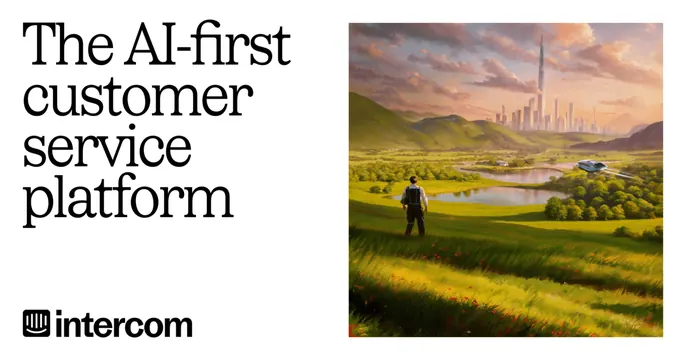
Split OG card with a serif headline on a white left half and a photographic landscape on the right.
Summary
A vertically split OG card: a large left-aligned serif headline on white, paired with a wide golden-hour landscape photograph on the right.
Visual description
The card is divided into two halves. The left half is plain white and carries a three-line headline ("The AI-first customer service platform") set in a near-black humanist serif, left-aligned, with the Intercom wordmark and bird-style logo anchored bottom-left. The right half is a photographic scene of a rolling green valley and hills under a warm dusk sky, with a tiny figure standing in the foreground grass and a faint cluster of towers on the horizon. The crisp white panel and the soft, naturalistic photo create a calm, editorial contrast.
Key takeaway
The split of flat white editorial type against a full-bleed atmospheric landscape photo. Letting one serene photograph carry all the emotion while the copy side stays austere and quiet.
Reuse notes
Good for a brand that wants to read as mature and human rather than techy. Needs a genuinely strong, evocative photograph to justify giving it half the canvas. The serif headline keeps it from feeling like a generic SaaS card.