Preview image. Unlock full-res
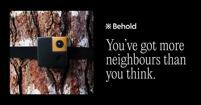
Split dark OG card with a square product photo of a tree-strapped trail camera on the left and a serif tagline plus asterisk-mark wordmark on the right.
Summary
A two-panel dark card placing a real product photo against a serif headline. The split of warm hardware imagery and a calm literary tagline is the defining move.
Visual description
The card is divided into two halves on black. The left holds a square, rounded-corner photograph of a small black-and-amber trail or wildlife camera strapped to a pine trunk, the bark warmly textured in browns and creams. The right half, on plain black, carries a small asterisk glyph beside the "Behold" wordmark in white at the top, then a large serif headline reading "You've got more neighbours than you think." across three lines. The serif type feels editorial and humane against the technical hardware shot.
Key takeaway
Pairing a single warm product photo with an unexpectedly literary serif line, separated cleanly into halves on black. The asterisk-plus-wordmark lockup is a tidy, ownable brand signature.
Reuse notes
Good for a hardware or consumer product that wants warmth and storytelling rather than spec-sheet energy. Needs one strong, well-lit product photo to fill the left panel. The serif tone suits lifestyle and nature-adjacent brands; it would feel soft for enterprise software.