Preview image. Unlock full-res
A 116-slide black-and-white sustainability impact report for On that pairs full-bleed atmospheric photography with oversized grotesque headlines and a dense black-on-white data appendix.
Summary
A 116-slide annual sustainability and impact report for the running brand On. Its personality is pure Swiss editorial: a strict black-and-white system, a single oversized grotesque typeface doing all the headline work, and a steady rhythm that alternates full-bleed atmospheric photography against blunt all-caps utility chrome, before resolving into a long black-on-white data appendix.
Visual description
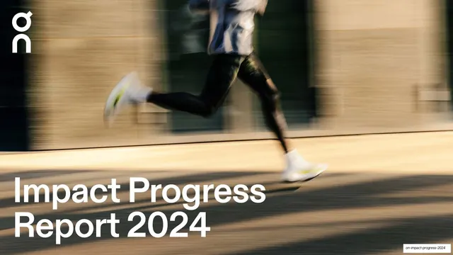
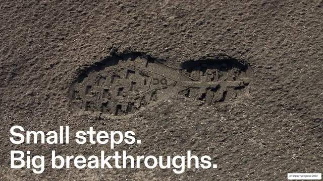
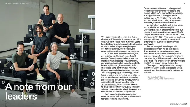
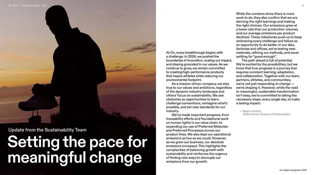
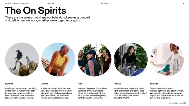
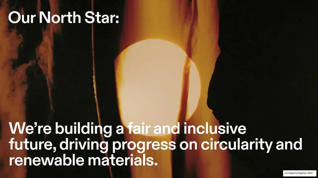
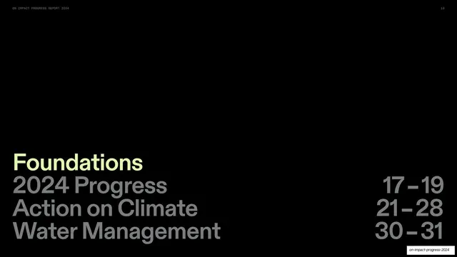
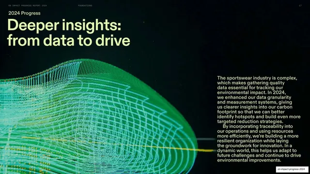
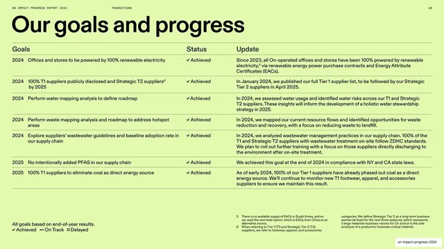
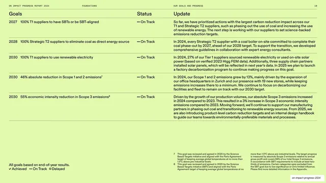
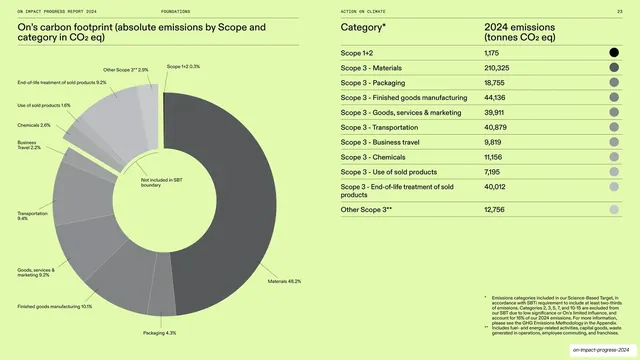
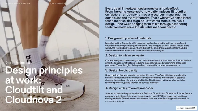
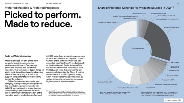
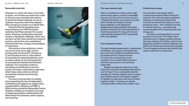
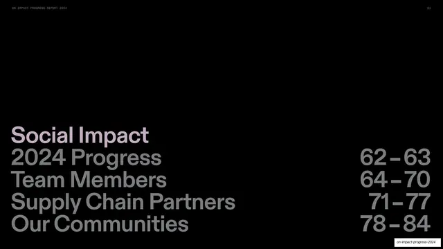
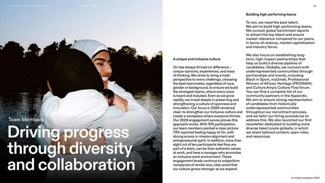
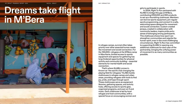
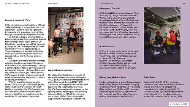
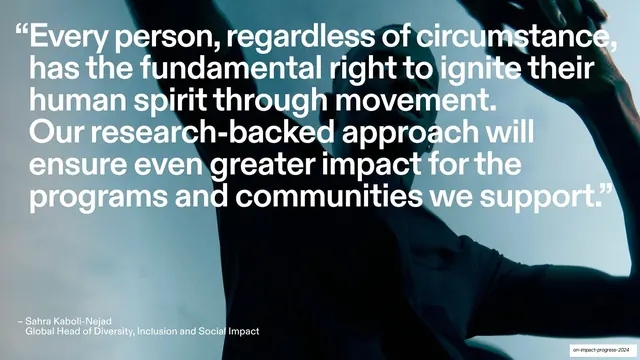
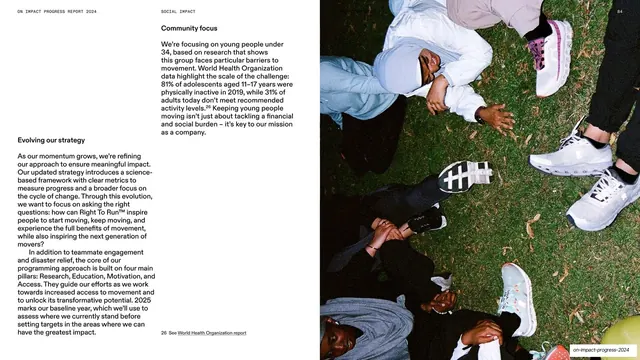
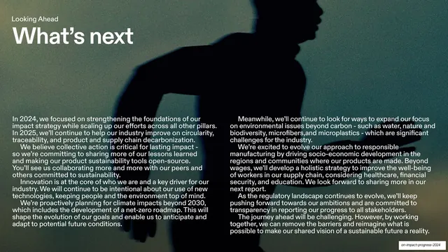
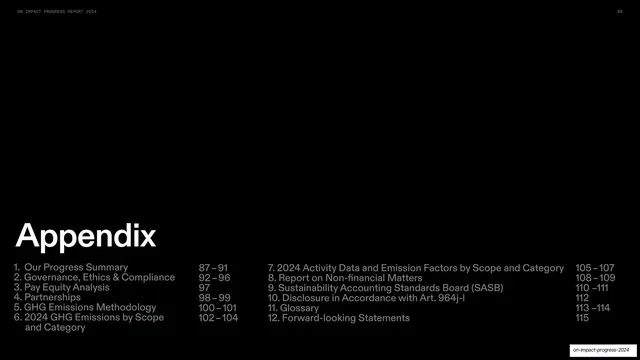
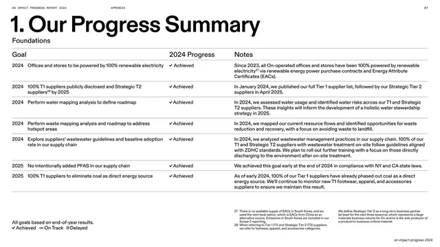
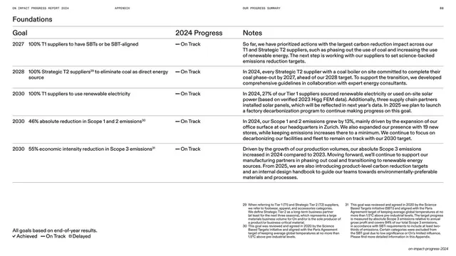
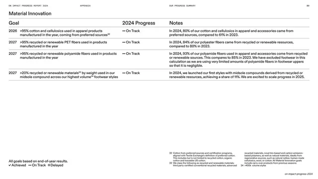
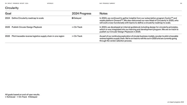
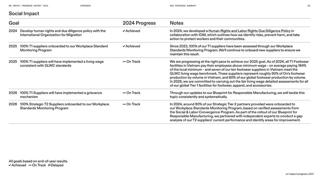
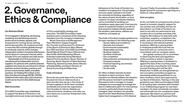
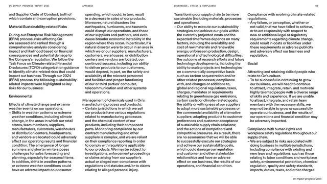
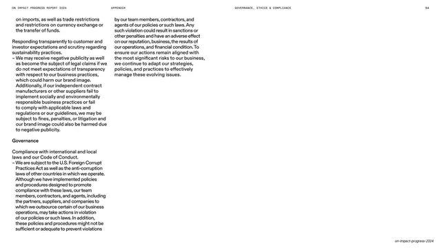
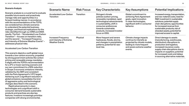
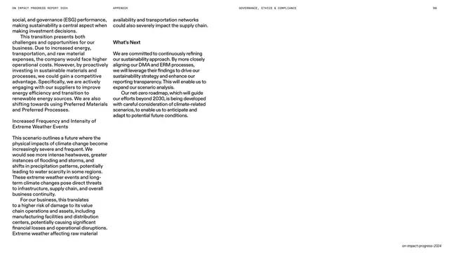
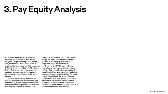
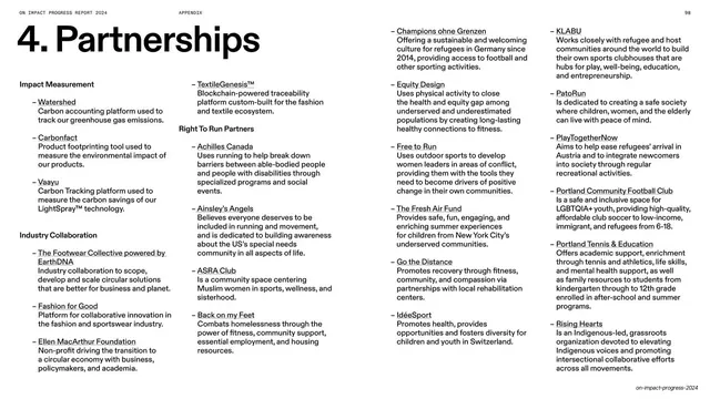
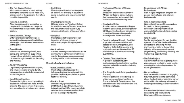
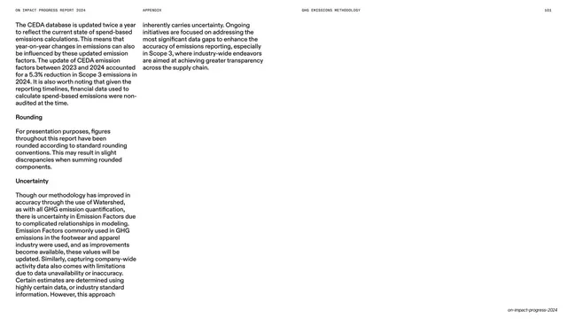
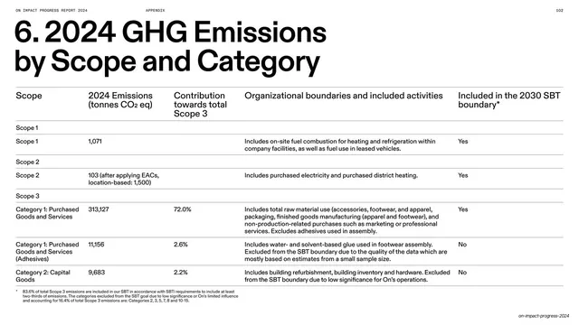
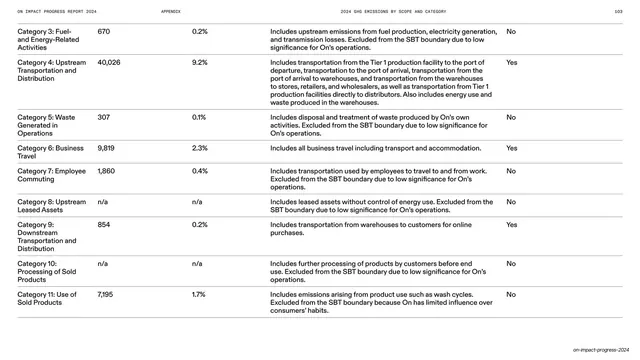
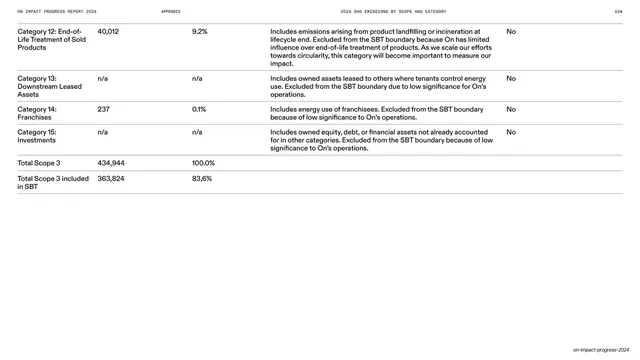
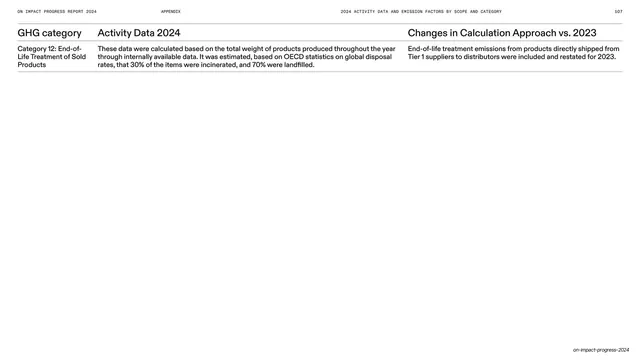
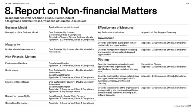
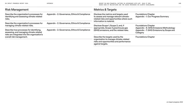
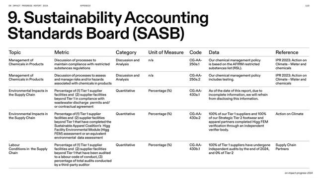
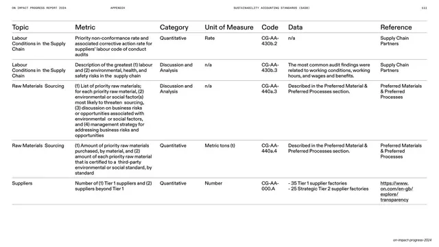
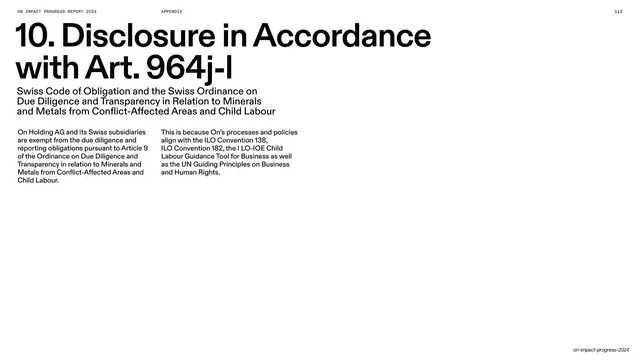
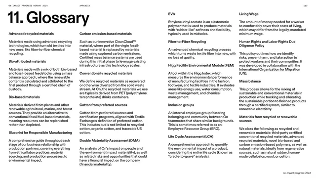
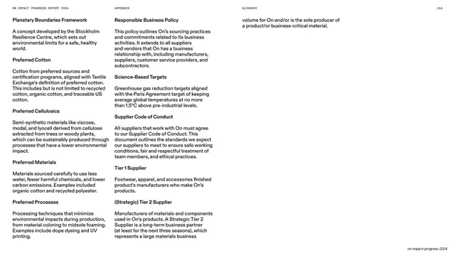
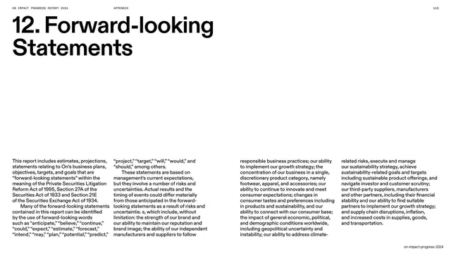
Slides run 16:9 in a two-state palette of true black and white, with mid-grey (#7A7A7A) used for de-emphasized text. Type is On's geometric grotesque sans throughout, set very large for headlines (often lowercase or sentence-case, breaking across two or three lines) and shrunk to a tiny monospace-feeling all-caps for the running header. A consistent header runs across the top of editorial pages ("ON IMPACT PROGRESS REPORT 2024" far left, an optional centered section label, and a numeric page number far right) on no visible rule. Recurring layouts: full-bleed photographic slides (a motion-blurred runner, a bootprint in dirt, crowds mid-stride, molten-orange material macros) with white display headlines and small justified body columns laid directly over the image; section-interlude slides that sit a white title at the lower-left above two or three greyed-out contents lines, each trailed by its page number flush right; a stat-stack slide that lists oversized headline figures (Released LightSpray, 84% recycled polyester, +13% emissions) against tiny right-aligned qualifiers on hairline rules; and a deep appendix of methodology and GHG-accounting pages that invert to black text on white, using numbered section headers ("5. GHG Emissions Methodology") over multi-column running text and wide hairline-ruled data tables (Scope, 2024 Emissions, Contribution, Boundary). A repeated quiet move is the values grid of circular photo portraits captioned Explorer / Athlete / Team / Positive / Survivor.
Key takeaway
The discipline of a two-color (black/white) system carried across 116 slides without ever feeling monotonous, achieved by alternating image-led emotional spreads with text-only structural ones. The section-interlude pattern (big white title, greyed contents list, page numbers flush right) is a clean, reusable divider for any long report. And the willingness to set long body copy directly over full-bleed photography in a small justified column, trusting the photo's dark zones to hold the type.
Reuse notes
A strong reference for any long-form annual, ESG, sustainability, or impact report, and for premium brand reports that need to feel editorial rather than corporate. The full-bleed-photo-plus-overlaid-column spreads demand genuinely strong, tonally controlled photography to stay legible. The appendix table system is directly reusable for emissions, financial, or metrics disclosure. Built on On's bespoke grotesque; substitute a strong neo-grotesque (a Helvetica or Akkurat relative) to approximate it.
From this deck: On Impact Progress Report 2024
View deck