Preview image. Unlock full-res
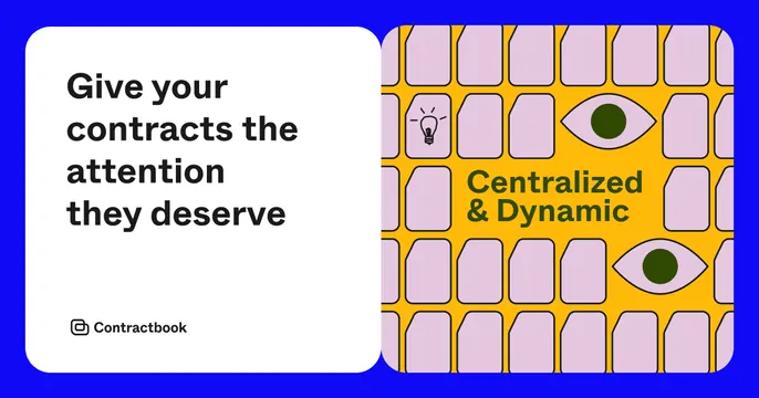
Split OG card inside a blue frame, pairing a white headline card with a yellow illustrated tile panel.
Summary
A two-panel OG card framed by a thick electric-blue border: a clean white headline card on the left and a busy yellow illustrated panel on the right. The bold color clash is the hook.
Visual description
A solid electric-blue background acts as a frame around two rounded white-bordered panels sitting side by side. The left panel is white with a four-line bold black sans-serif headline, "Give your contracts the attention they deserve", and the Contractbook logo and wordmark small in the bottom-left corner. The right panel is mustard yellow, filled with a grid of rounded lilac tile shapes; scattered among them are line-drawn motifs (a lightbulb, two open eyes with green pupils) and the words "Centralized & Dynamic" set in dark green. Everything is flat, outlined, and high-contrast.
Key takeaway
The split between a calm headline panel and a loud illustrated panel lets one card be both readable and characterful. The blue frame unifies two very different halves into one object.
Reuse notes
Good for a brand with a strong illustration system that wants personality without burying the message. The text panel keeps it scannable in a feed; the illustrated panel carries brand voice. Reach for it when you have a distinctive icon/pattern library to fill the second panel.