Preview image. Unlock full-res
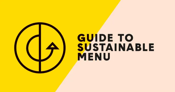
Split diagonal OG card pairing a black circular logo mark on yellow with an all-caps title on a peach panel.
Summary
A two-tone OG card divided by a diagonal seam: a yellow left half carries a black outlined circular logo, and a peach right half holds an oversized all-caps title.
Visual description
The canvas is split by a single diagonal line running top-right to lower-center, dividing it into a bright yellow zone on the left and a soft peach zone on the right. Centered in the yellow zone is a black line-drawn circular mark combining a "G" curl and an upward arrow inside a ring. The right zone holds the title "GUIDE TO SUSTAINABLE MENU" set in a heavy condensed all-caps sans-serif, dark near-black, left-aligned across three lines. The title crosses the diagonal seam slightly, with its first line sitting partly over the yellow. No URL, tagline, or imagery beyond the logo.
Key takeaway
The diagonal two-tone split as a cheap way to separate brand mark from message while keeping one flat, punchy composition. The black-on-yellow logo plus heavy condensed caps reads instantly at thumbnail size.
Reuse notes
Good for a cause-driven or food/sustainability brand that wants energy without photography. The diagonal seam slightly clipping the headline is a deliberate-looking overlap; keep type weight high so it survives small renders. Works best with a saturated primary plus a pale neutral.
More like this






Keep what you find
A free account saves references to boards and can send you a weekly email of picks based on what you save.
To see every result, go Pro.