Preview image. Unlock full-res
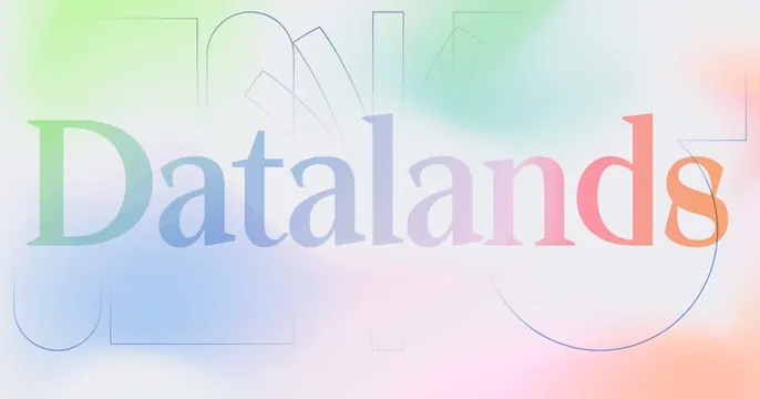
Soft pastel-gradient OG card with the word Datalands set large in a serif whose letters are tinted by the rainbow wash, over faint outline shapes.
Summary
A dreamy OG card where the single word Datalands is set in a large serif whose strokes pick up a soft pastel rainbow gradient, floating over faint geometric outlines.
Visual description
The background is a gentle multicolor wash blending pale green, blue, lilac and peach. Centered, the word "Datalands" runs across the full width in a refined high-contrast serif, but instead of a flat color each letter is tinted by the gradient beneath it, so the type shifts from green at the left to coral at the right. Behind and around the word sit very faint thin-line outline shapes (arches, rectangles and a circle) that read like a ghosted oversized "TYPO" or structural sketch.
Key takeaway
Letting the wordmark borrow its color directly from a soft background gradient so type and field become one continuous wash. The barely-there outline shapes add structure and depth without adding contrast or clutter.
Reuse notes
Elegant for a data, research, or design-adjacent brand that wants calm rather than punch. The tinted serif needs a gradient subtle enough to keep the word legible. The faint outlines should stay at very low contrast or they will fight the type.