Preview image. Unlock full-res
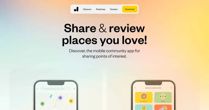
Soft pastel-gradient card with a centered pill navbar, an oversized "Share & review places you love!" headline and two phone mockups peeking up from the bottom.
Summary
A pastel-gradient card that mirrors a landing page: a floating pill navbar up top, a centered bold headline, and two phone mockups rising from the bottom edge.
Visual description
Background is a soft horizontal gradient from cool blue-green at left into warm peach and yellow at right. A white rounded pill navbar floats near the top with a small logo, the links Discover, Roadmap, Contact, and a yellow Download button. Below, a centered near-black headline "Share & review places you love!" mixes a serif ampersand into the sans-serif words, followed by two lines of gray sub-copy. Two phone mockups peek up from the bottom: a map screen with colored location pins on the left and a French-language category grid on the right. The phones are cropped by the lower edge.
Key takeaway
Treating the OG card like a miniature hero, complete with a floating pill nav, instantly reads as "this is a product site." The serif ampersand inside a sans headline is a cheap, elegant accent.
Reuse notes
Works for a consumer or travel app that wants an inviting, soft feel. The cropped phones imply more below the fold; make sure the visible screens are the most recognizable. Pastel gradient keeps it gentle but lowers contrast, so keep headline type dark.