Preview image. Unlock full-res
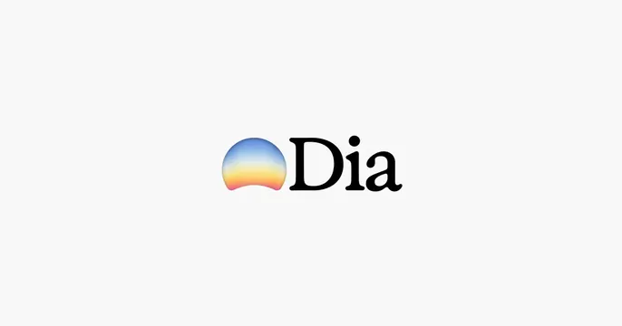
Ultra-minimal off-white card with a centered logo lockup: a gradient sunrise mark beside the serif wordmark Dia.
Summary
A pure brand card: nothing but the Dia logo lockup centered in a vast off-white field, letting the gradient sunrise mark and serif wordmark carry everything.
Visual description
Light grey, almost white background with no texture. Dead center sits the logo lockup: a small rounded mark shaped like a rising sun, filled with a soft top-to-bottom gradient from sky blue through cream to warm orange-pink, set beside the wordmark "Dia" in a clean black high-contrast serif with a tittle dot over the i. Generous empty space surrounds the lockup on all sides. No headline, no product, no other elements.
Key takeaway
The confidence of a logo-only card: when the mark is beautiful, maximum whitespace makes it feel premium and assured. The warm gradient inside an otherwise monochrome lockup is the single point of color and does all the emotional work.
Reuse notes
Best once a brand is established enough that the name alone is the message, or for a teaser/launch moment. Reads as calm and high-end. Risky if the audience does not recognize the brand, since there is no supporting context. Light backgrounds only.